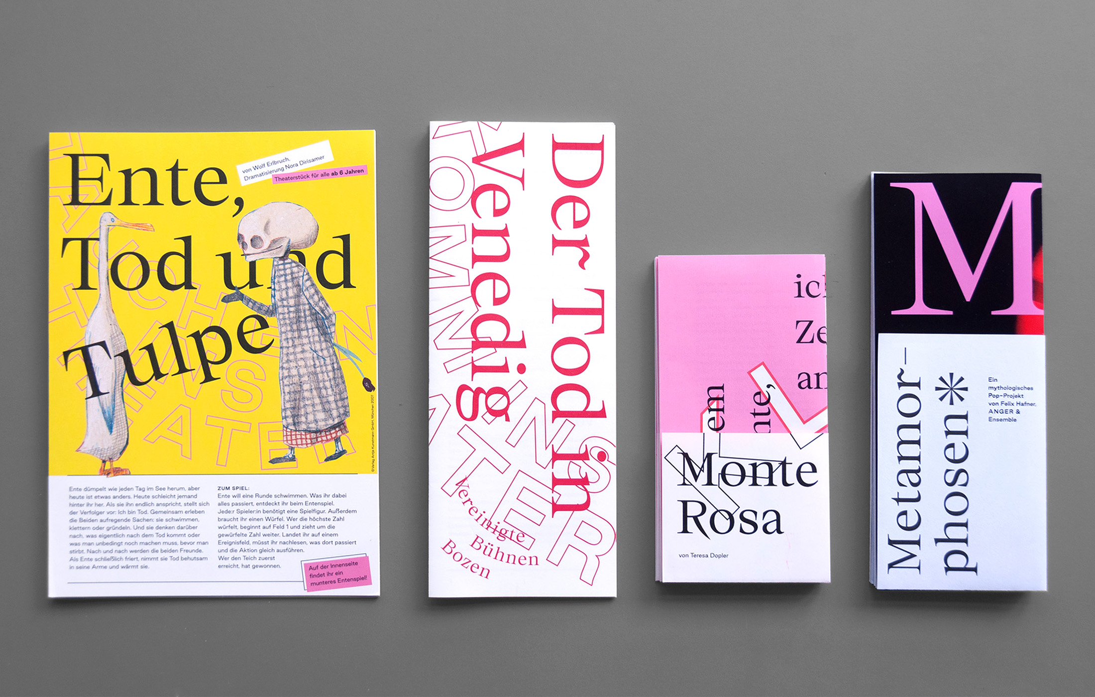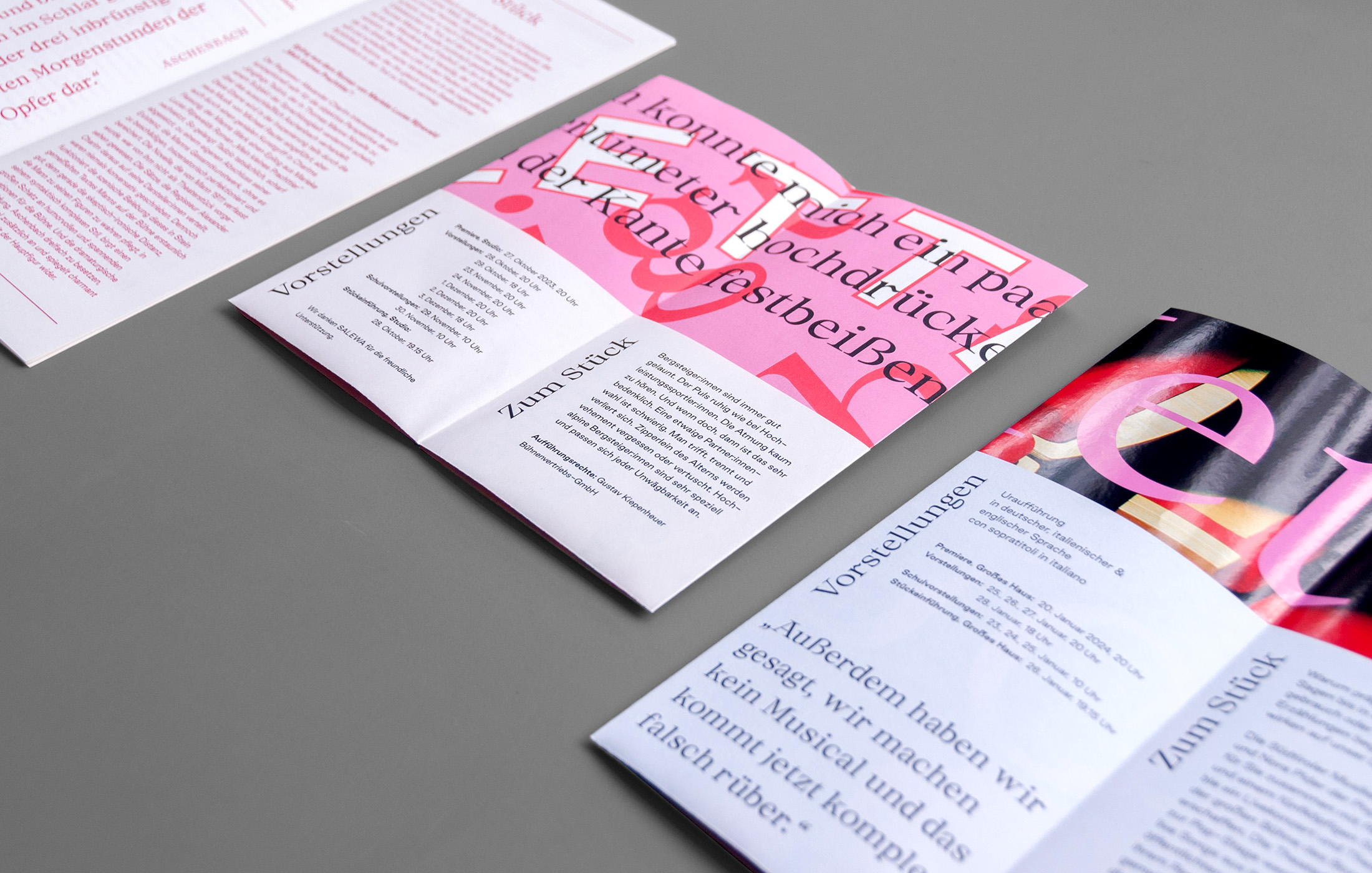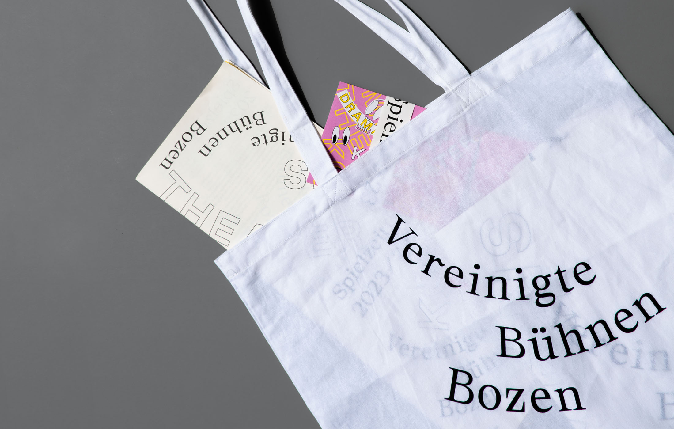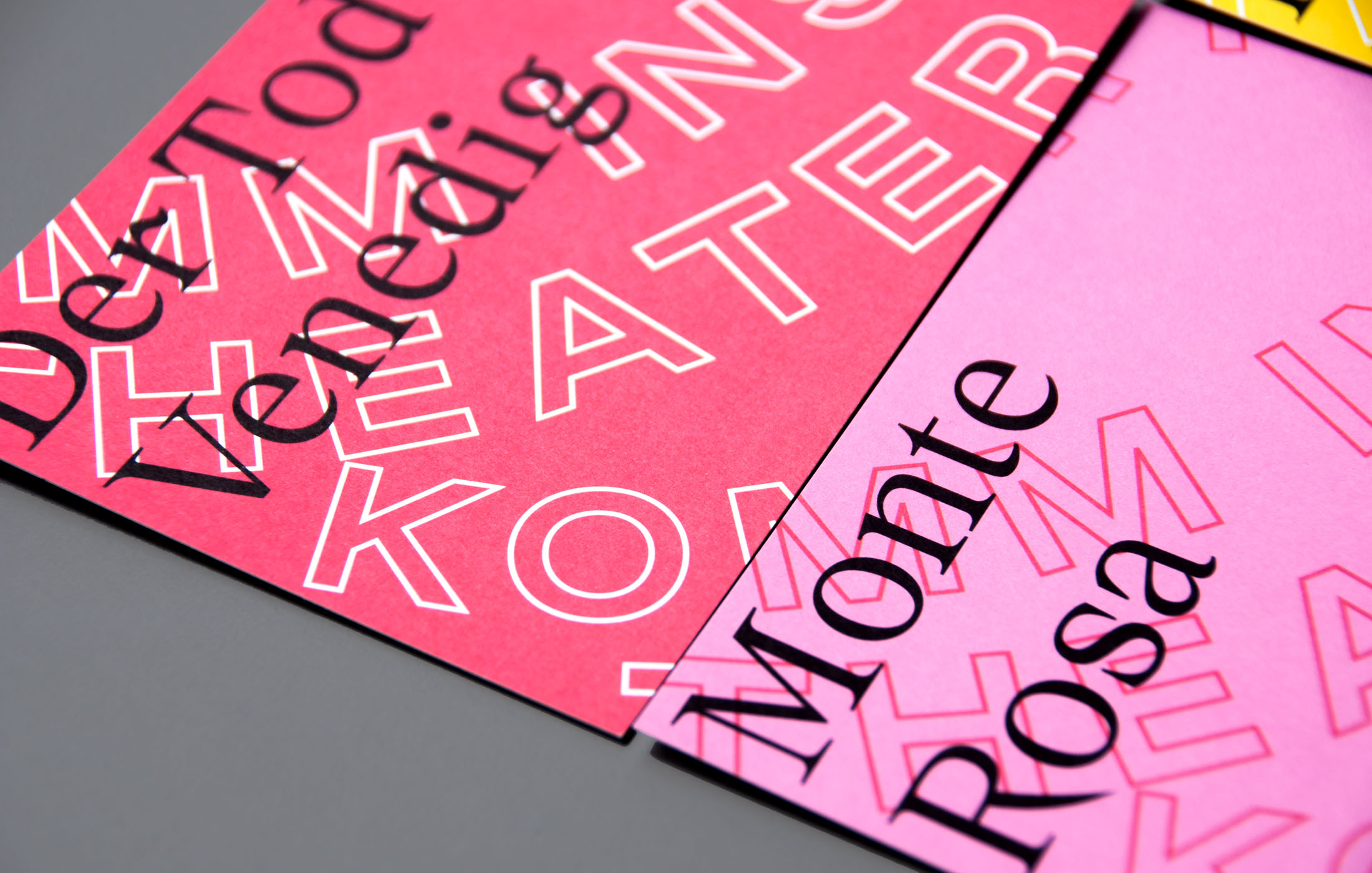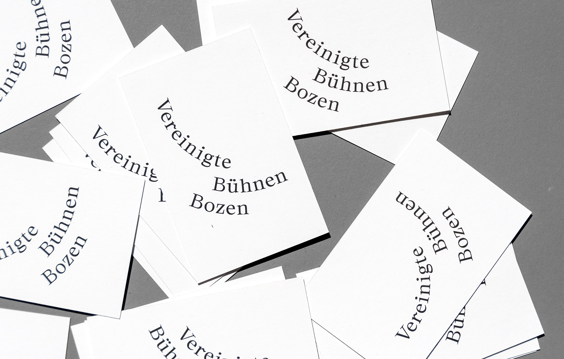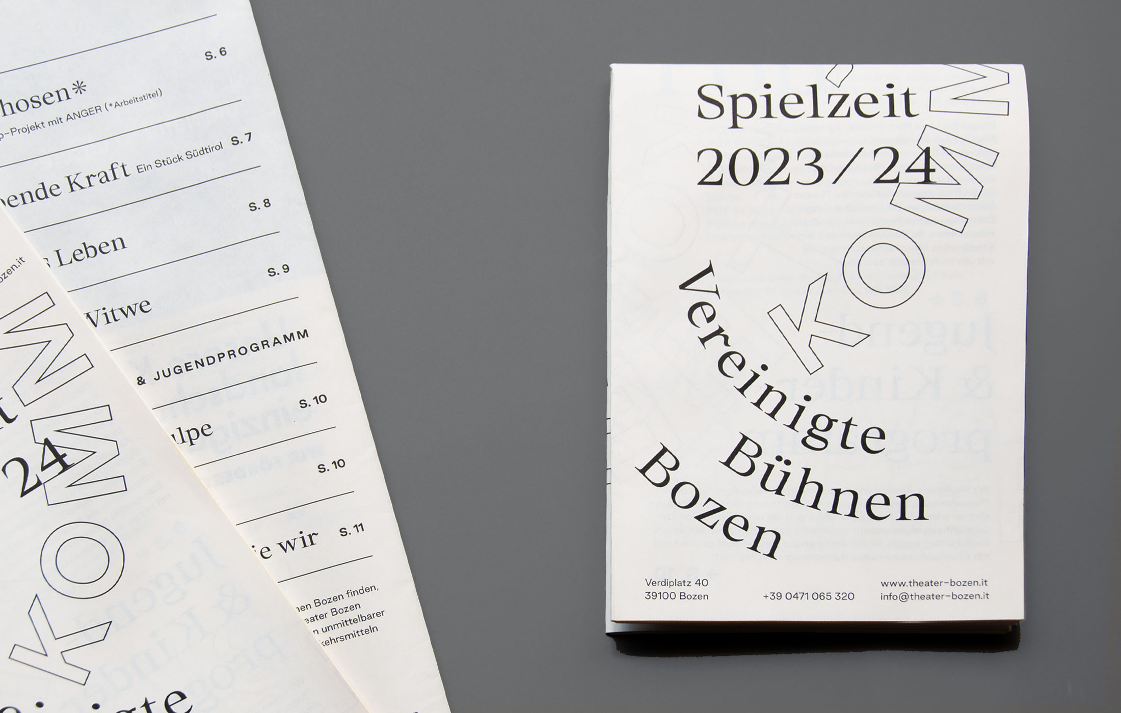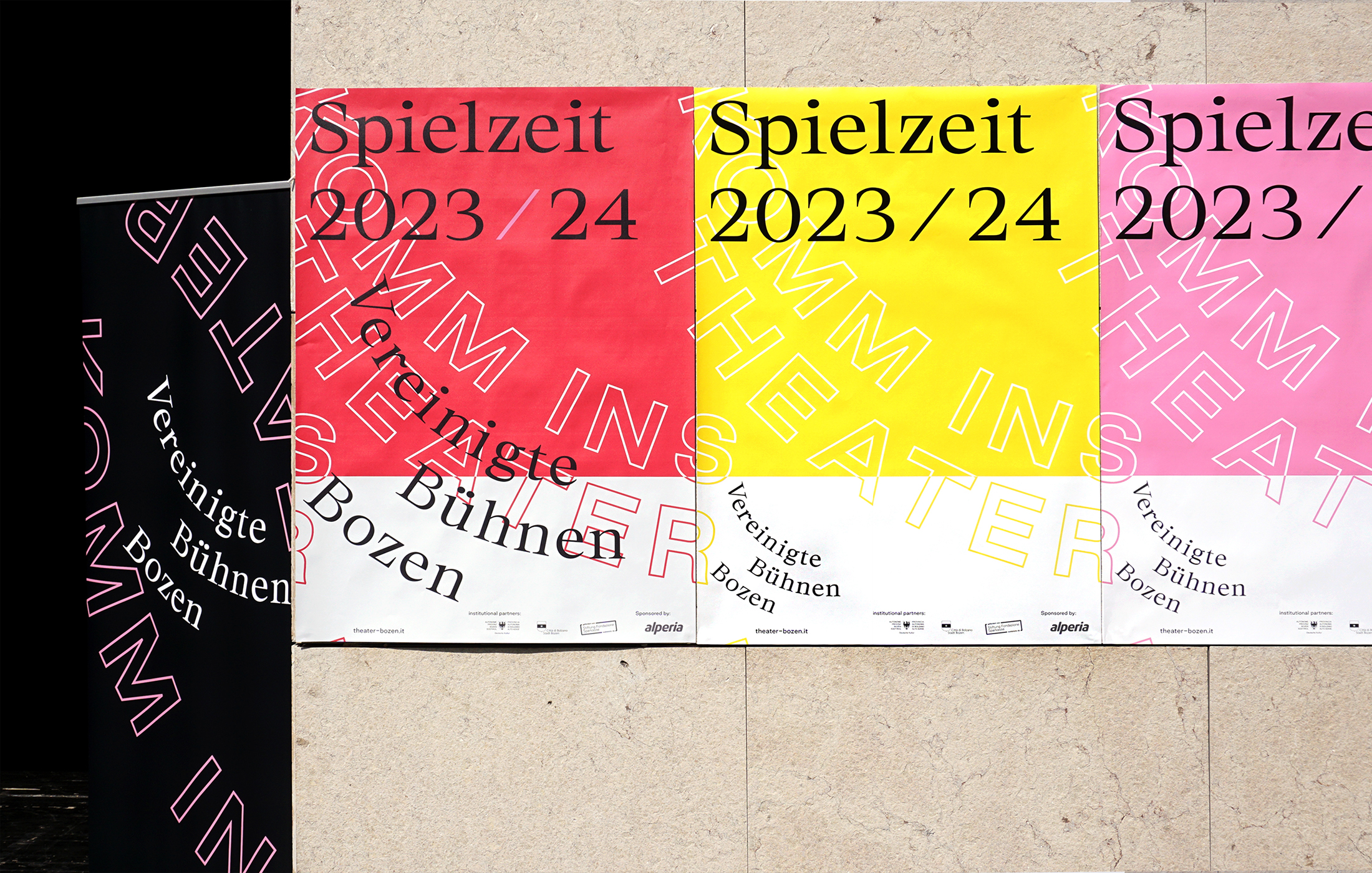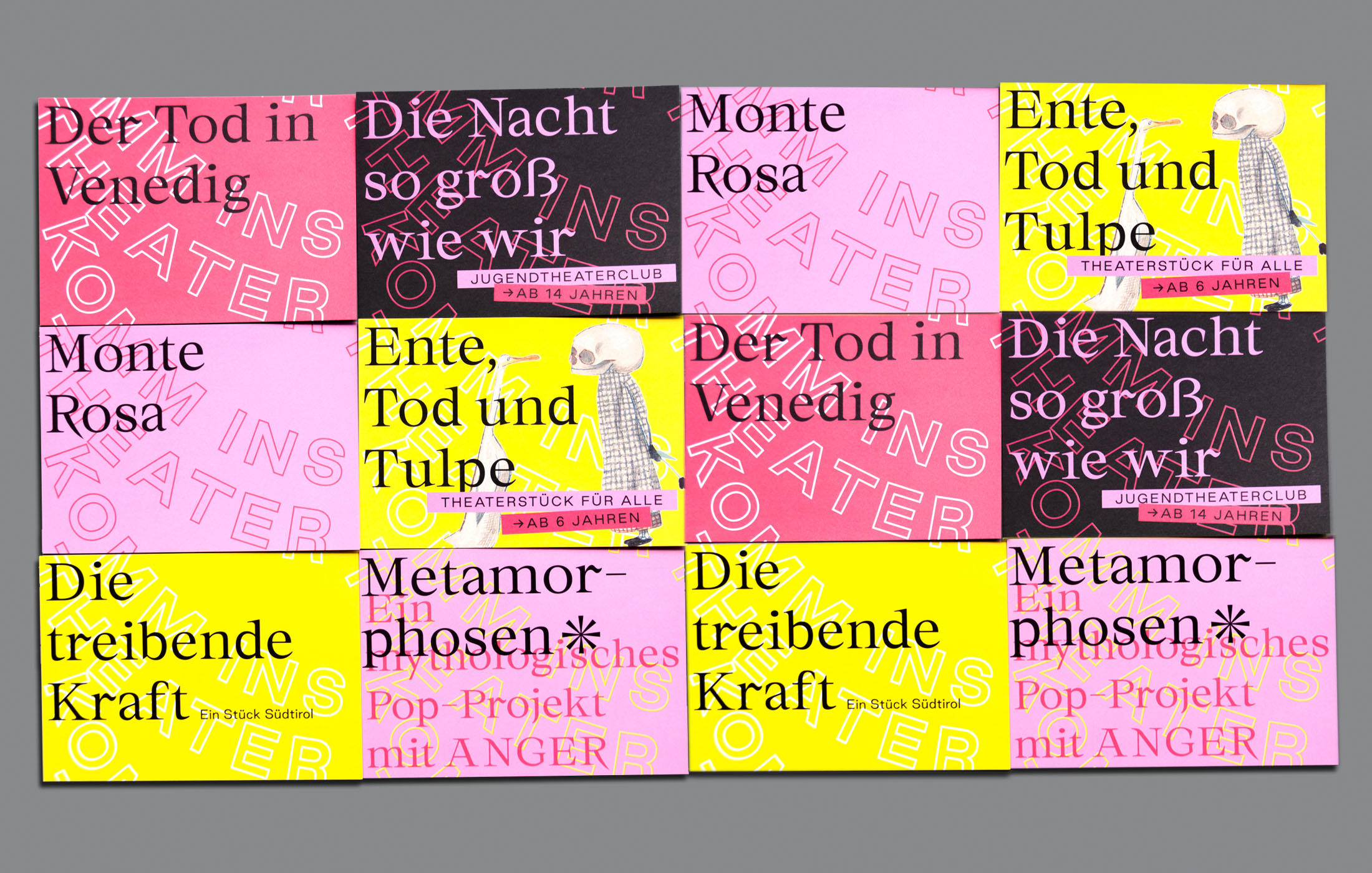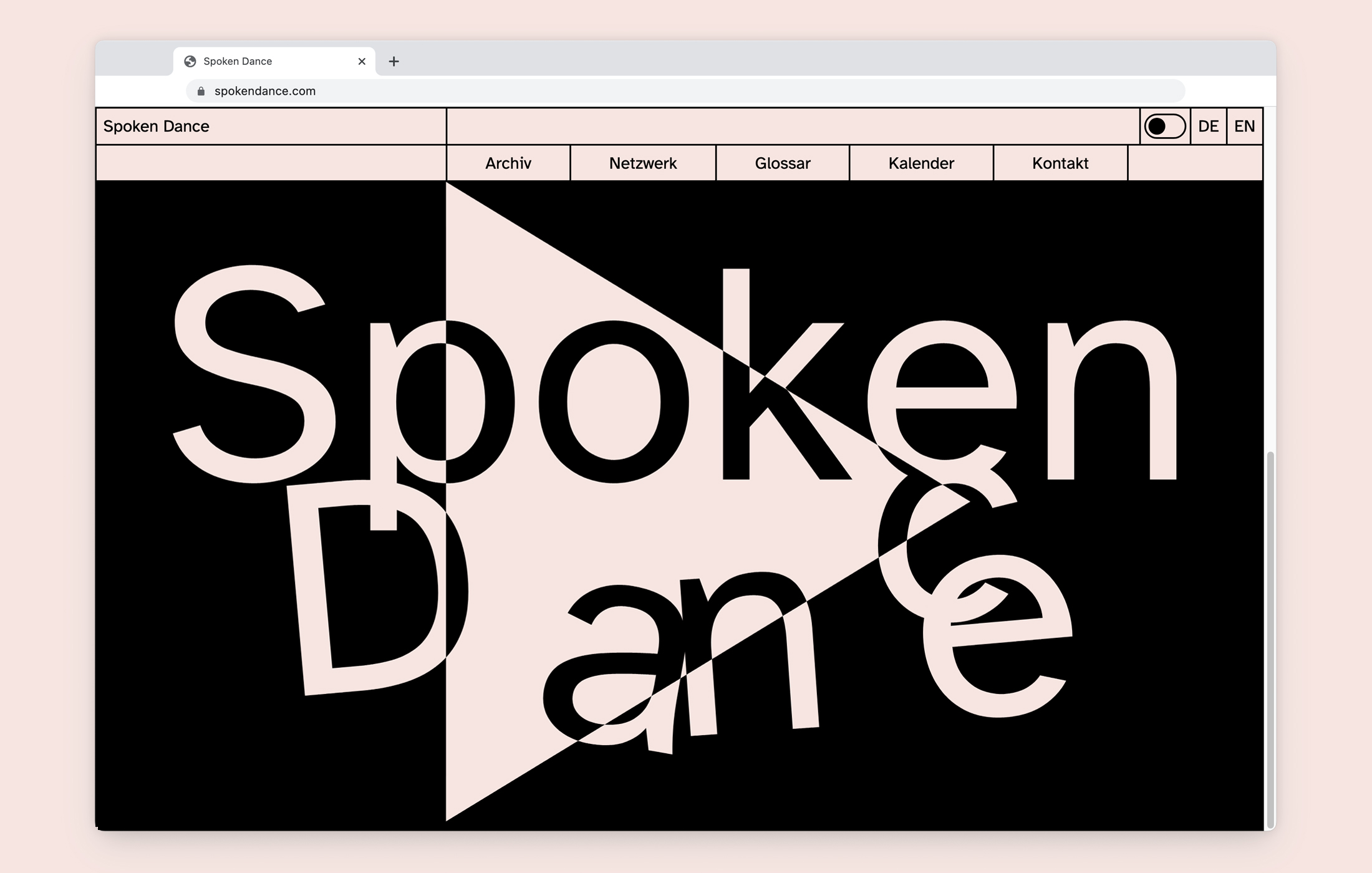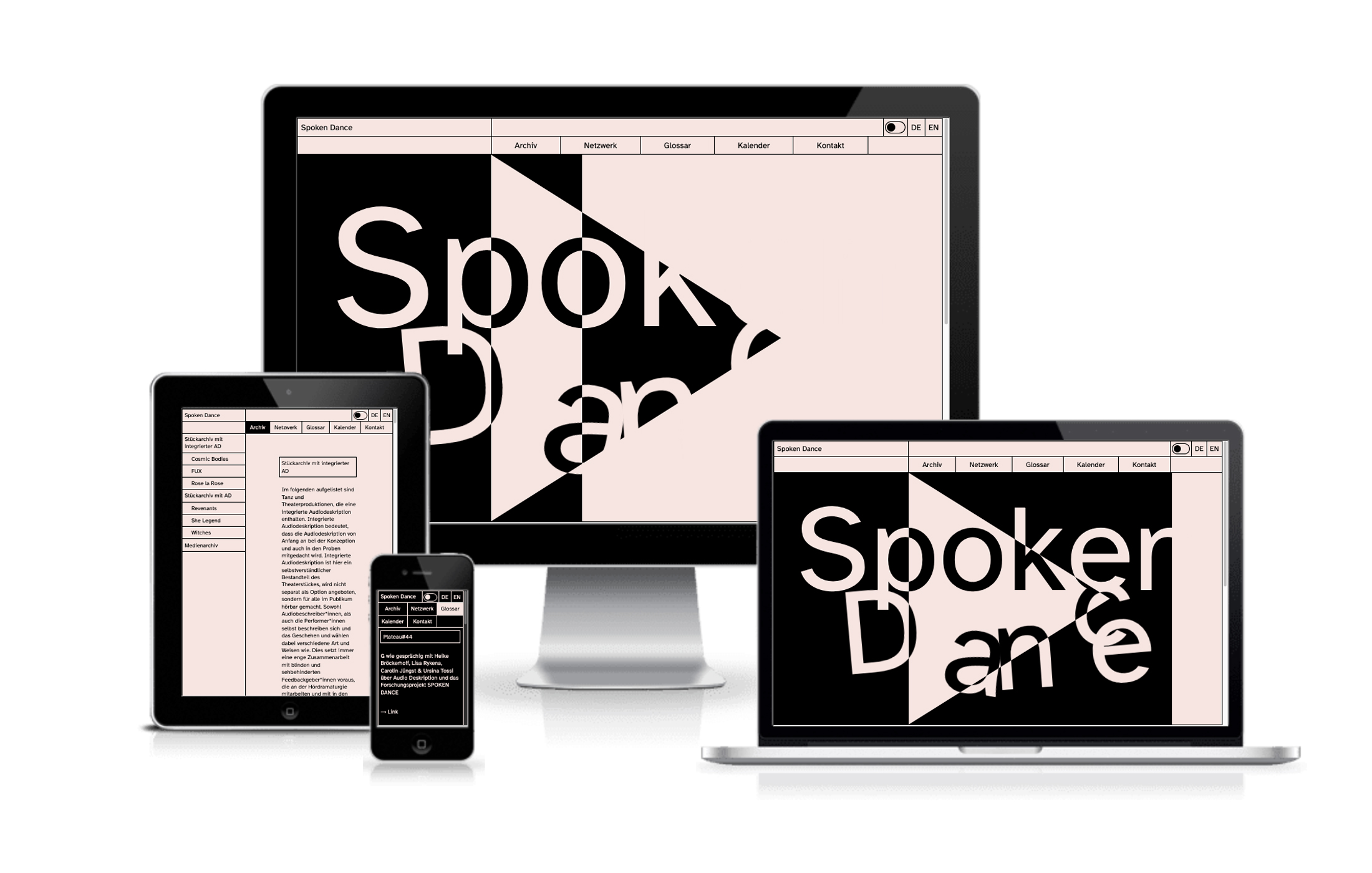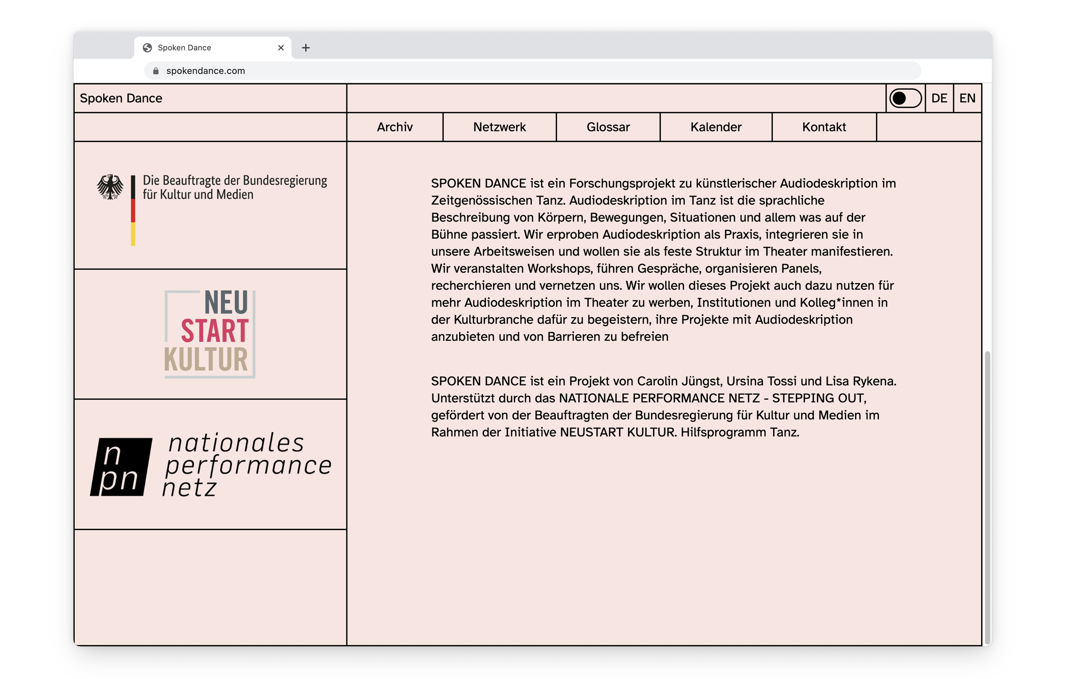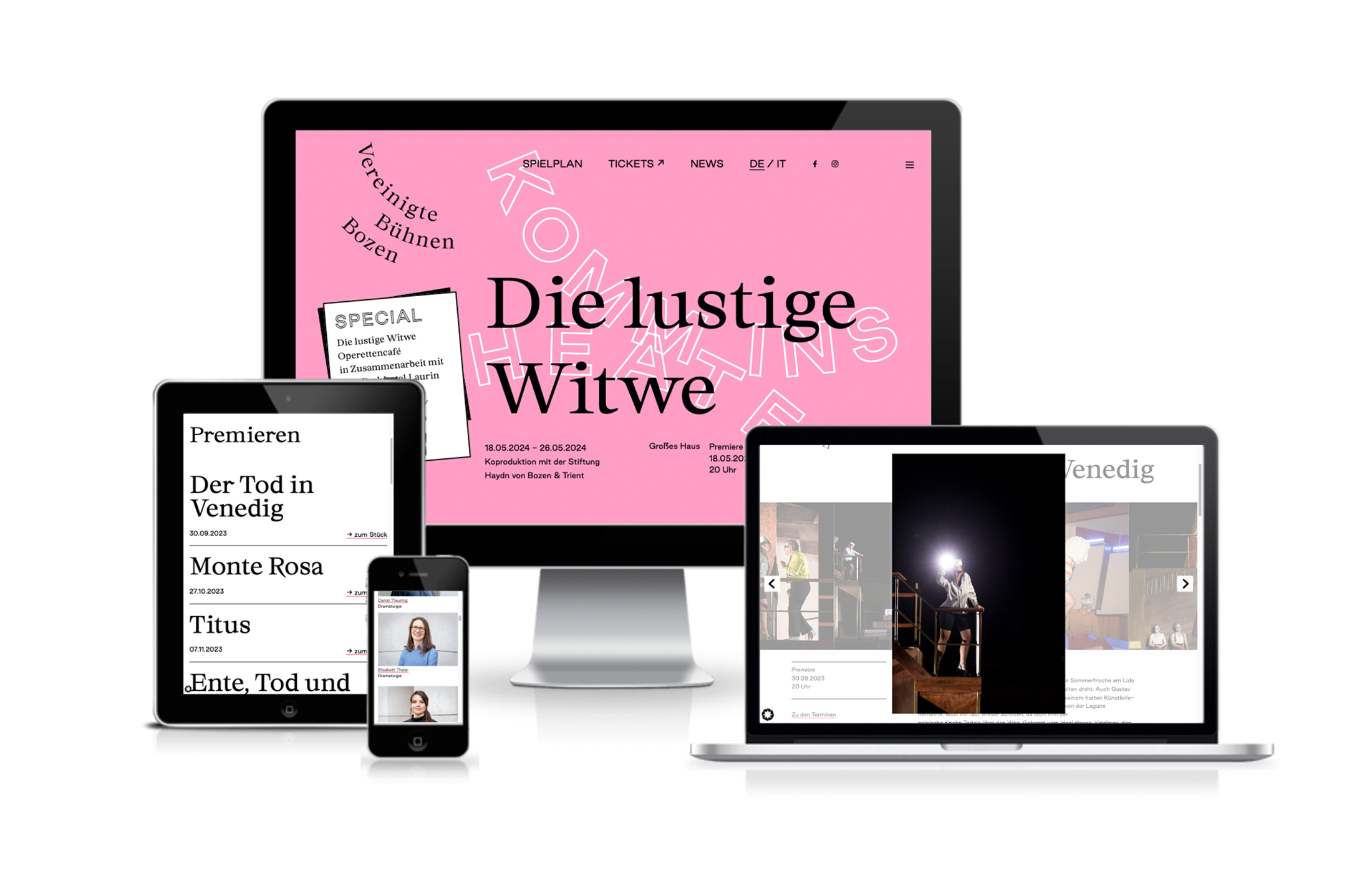
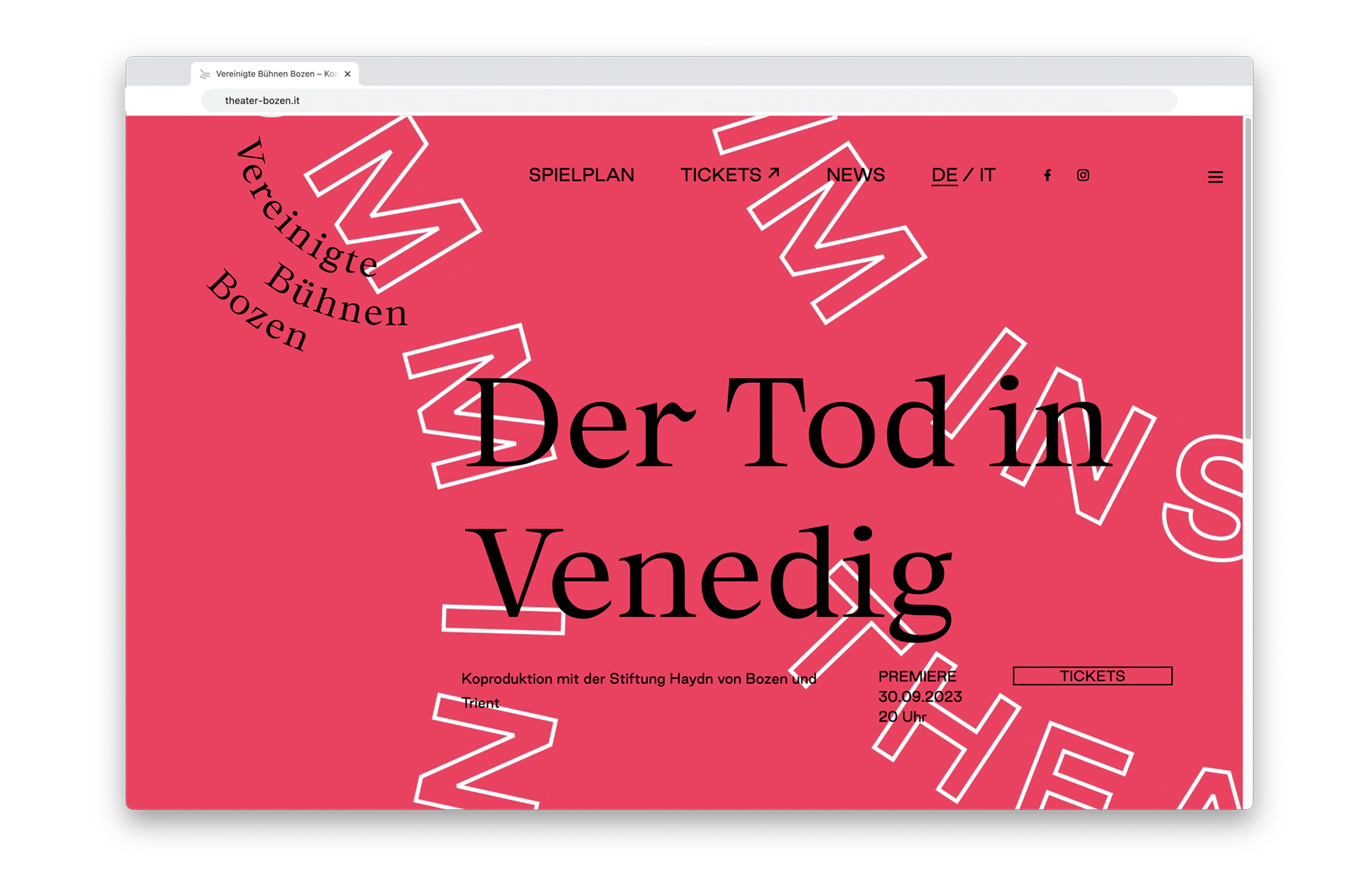
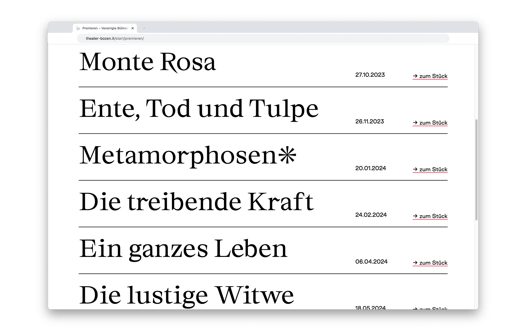
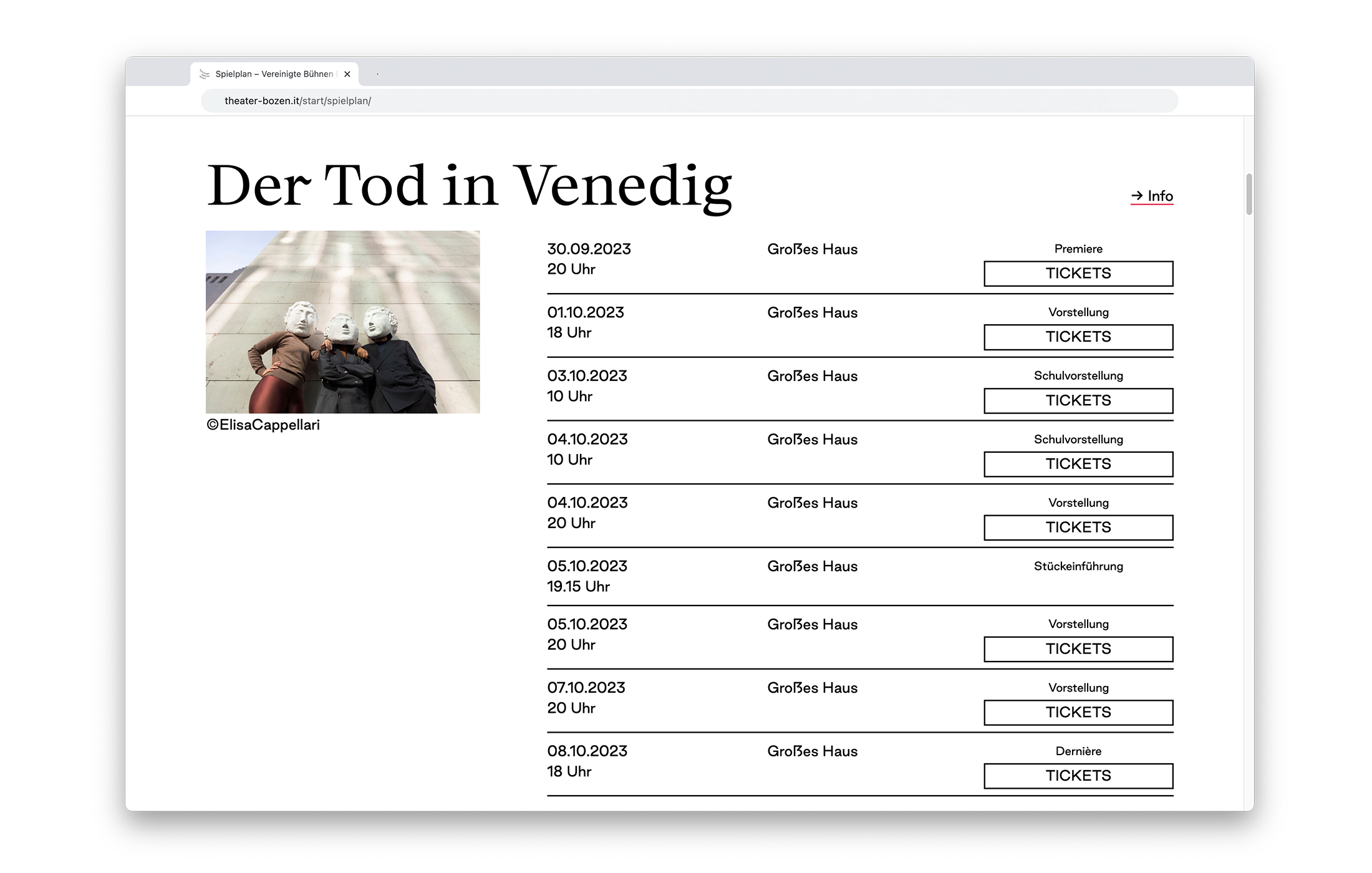

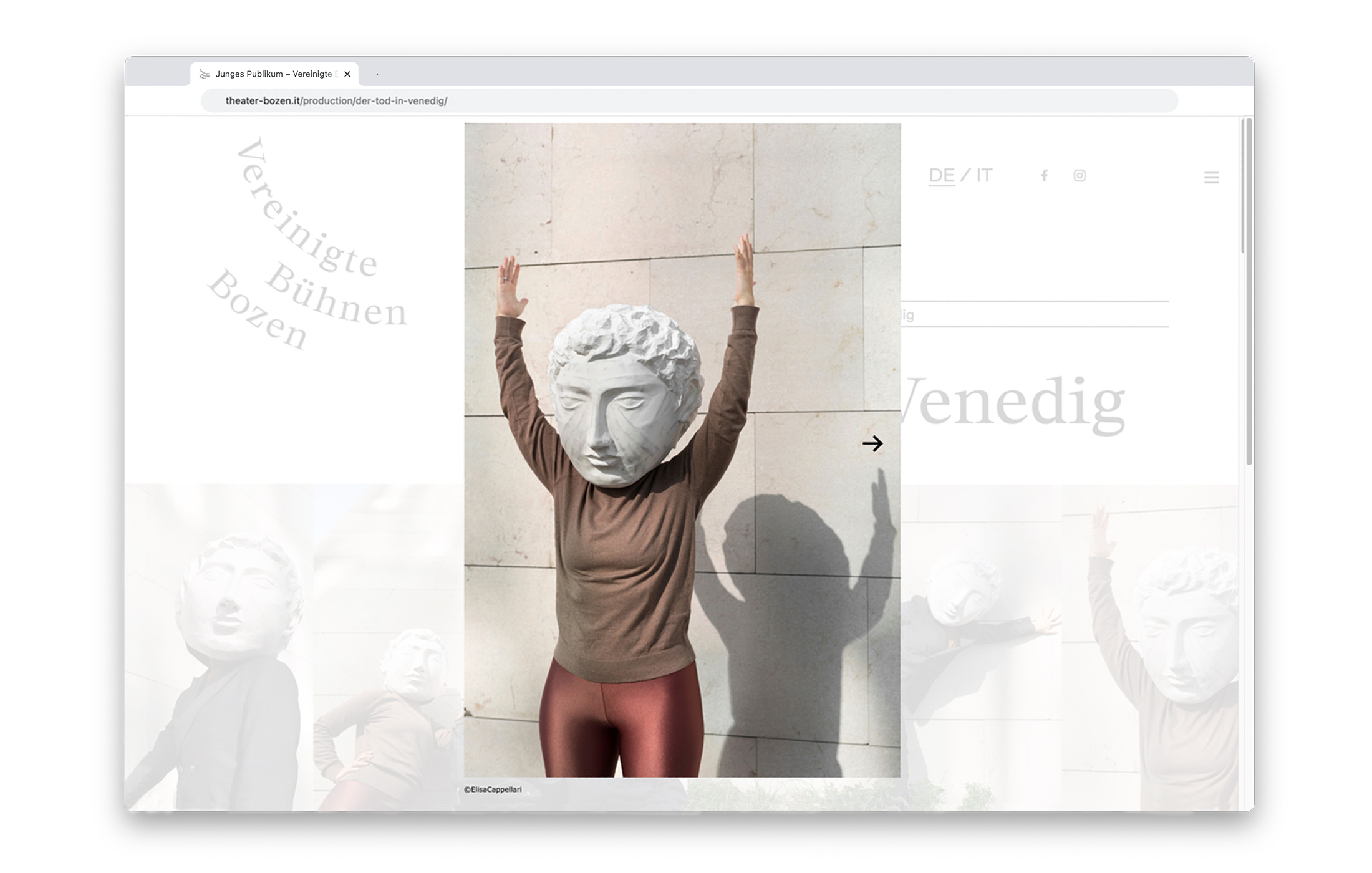
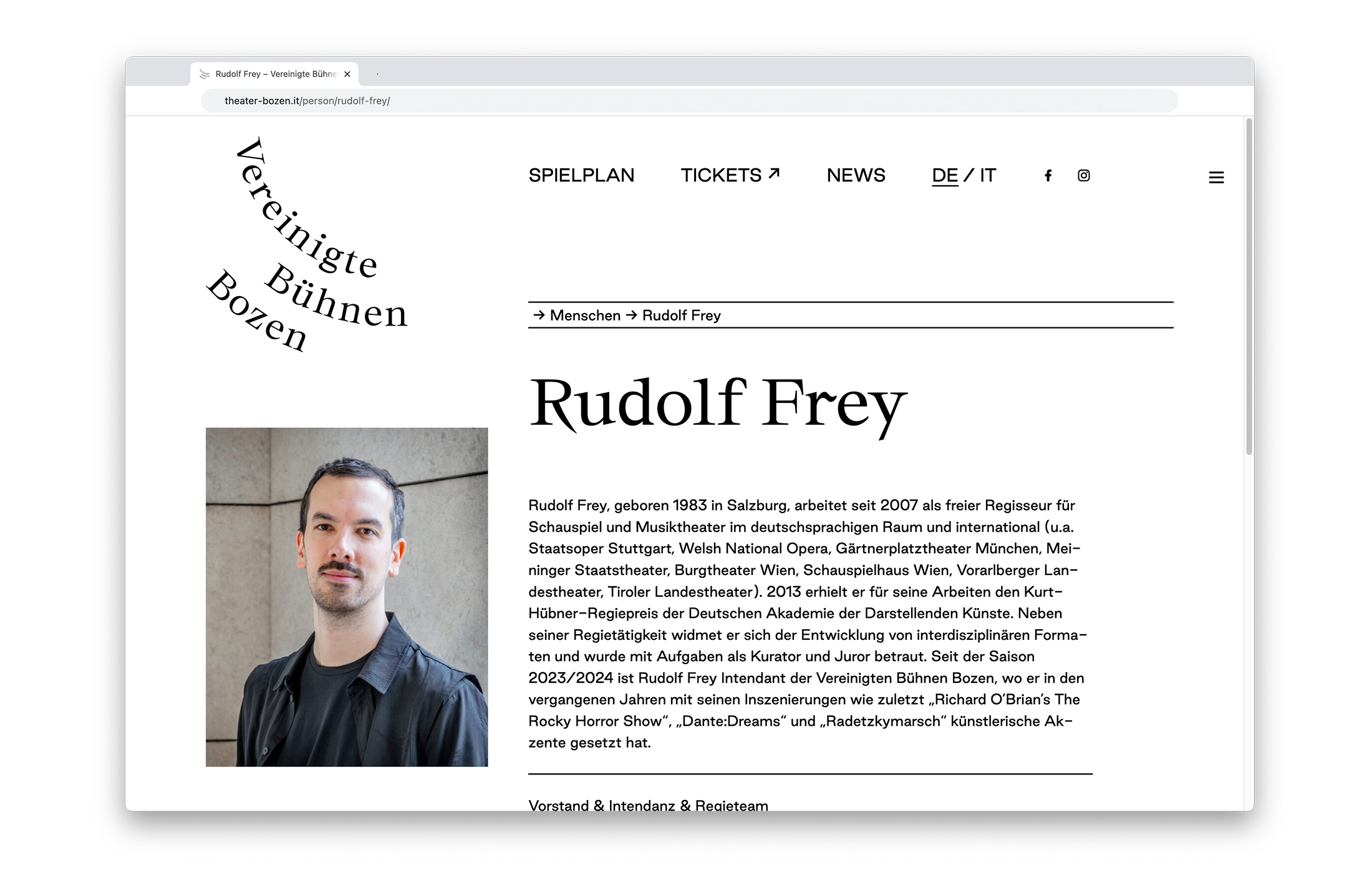
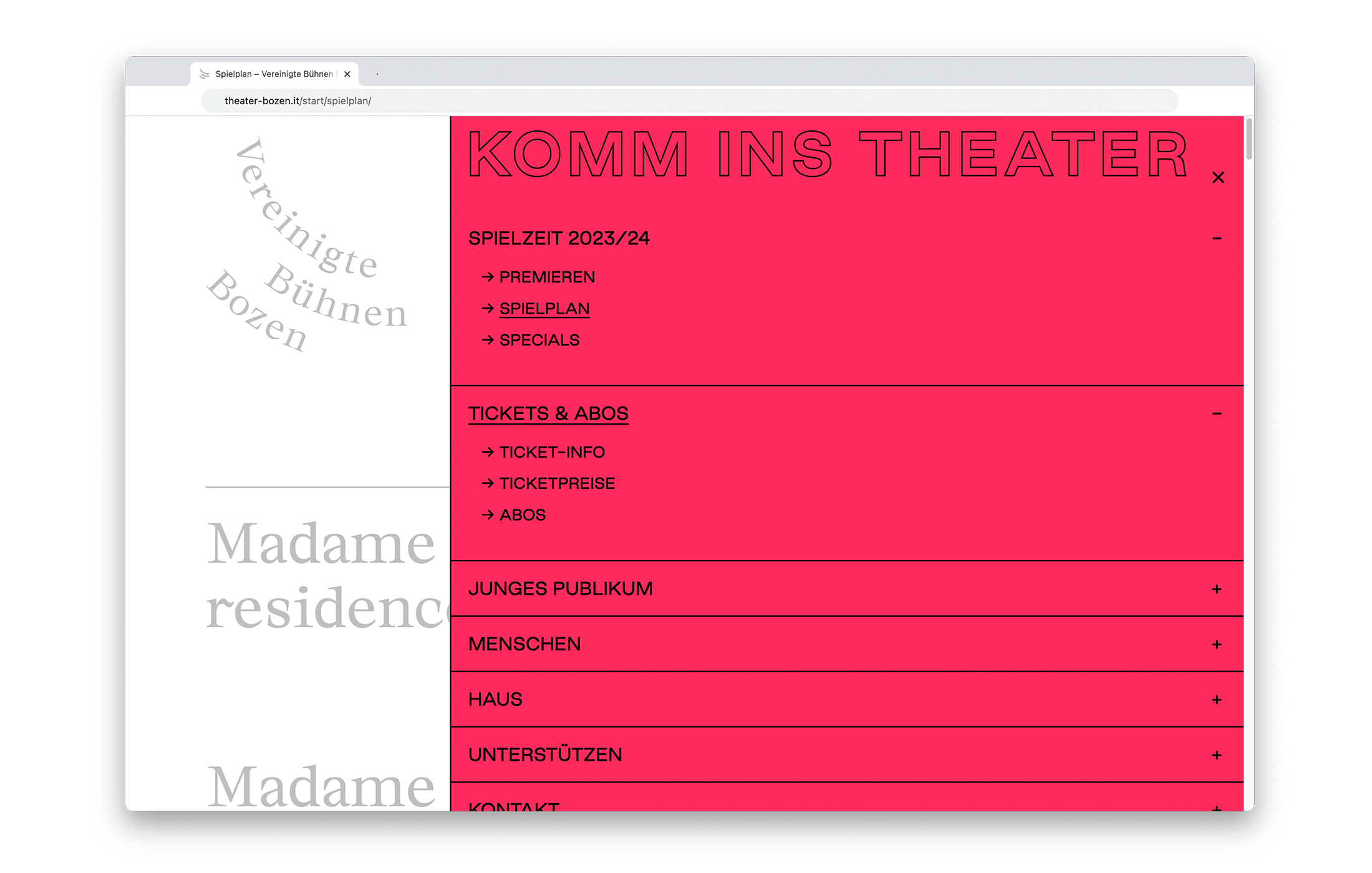
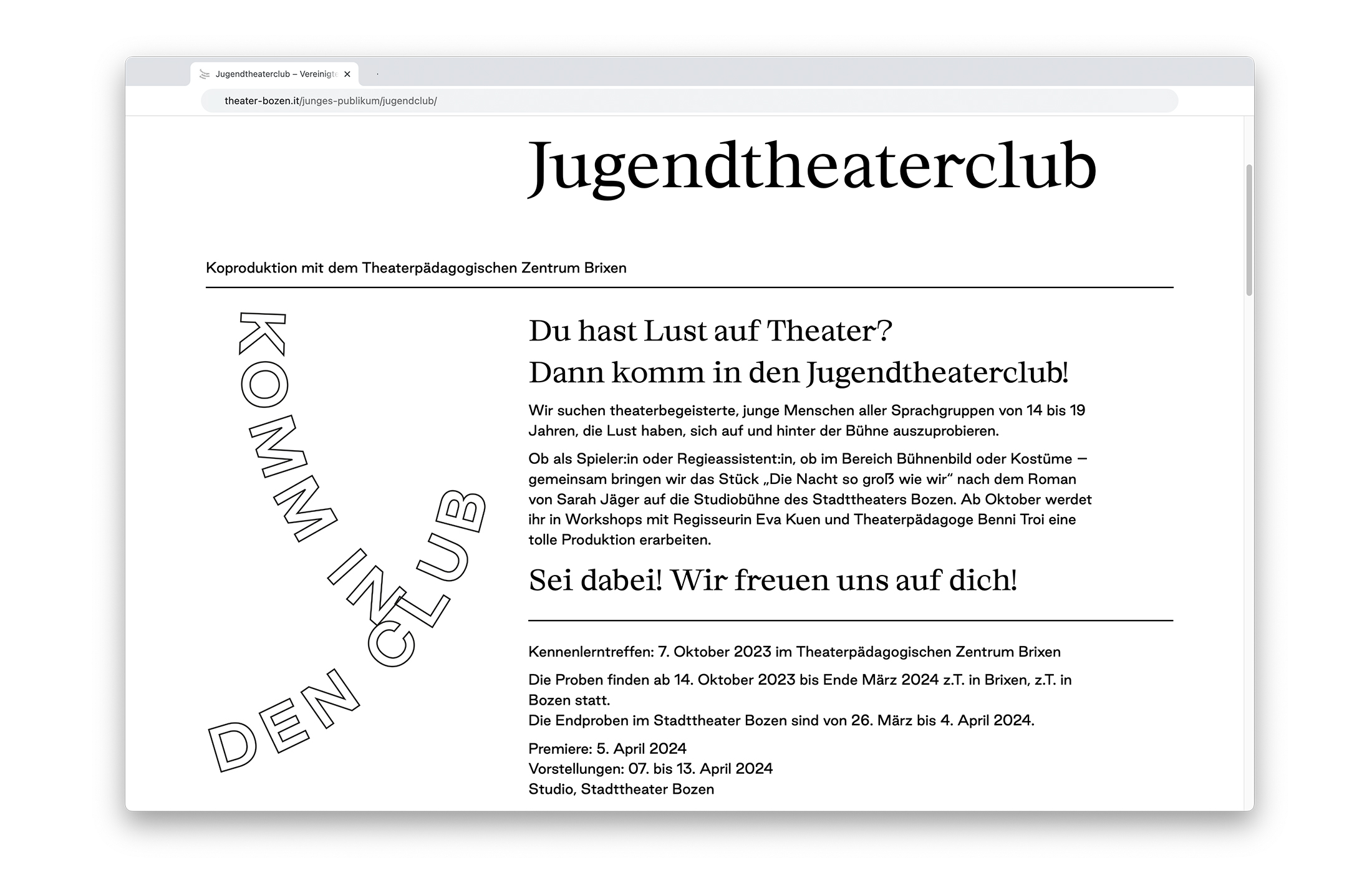
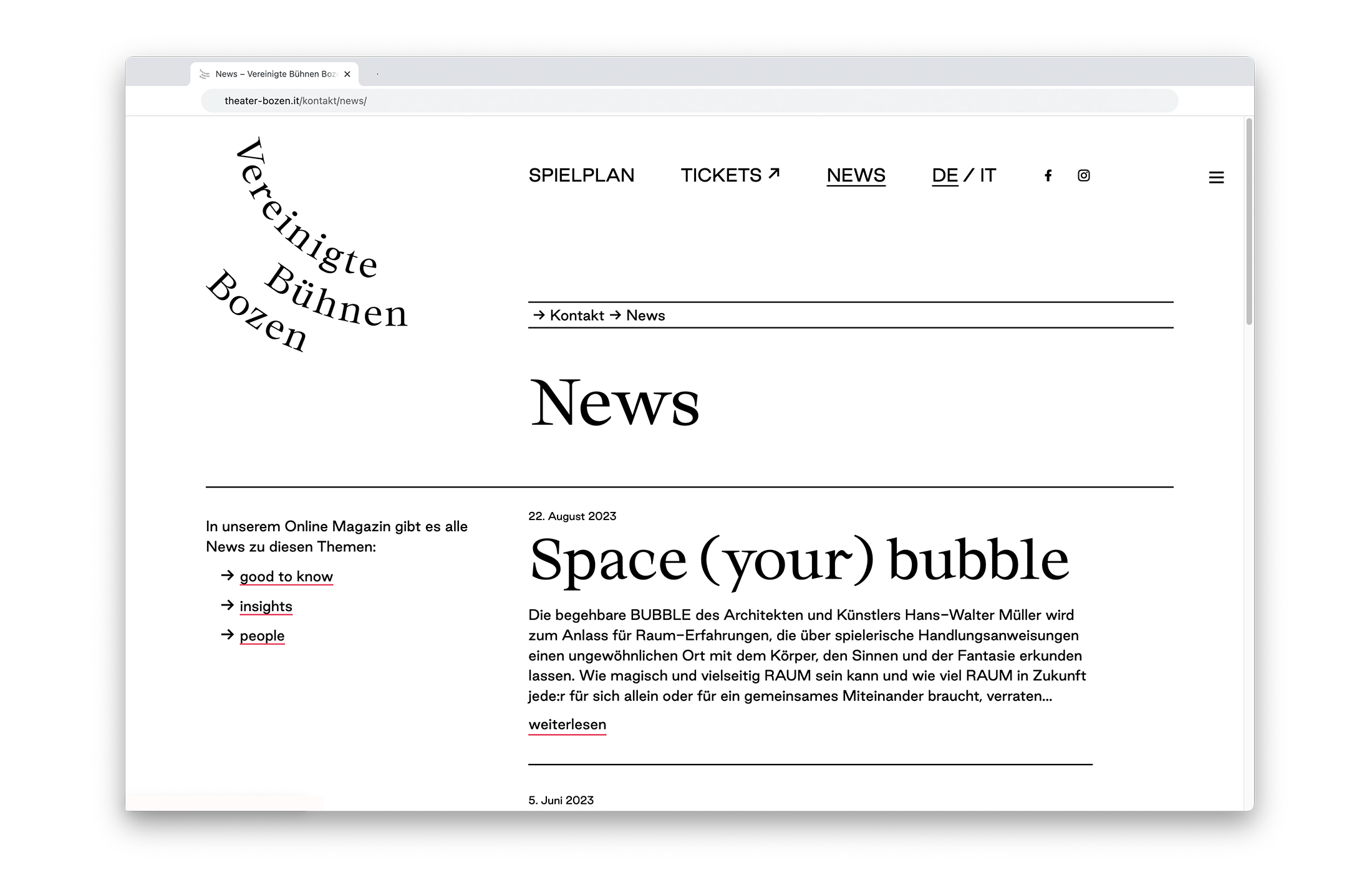
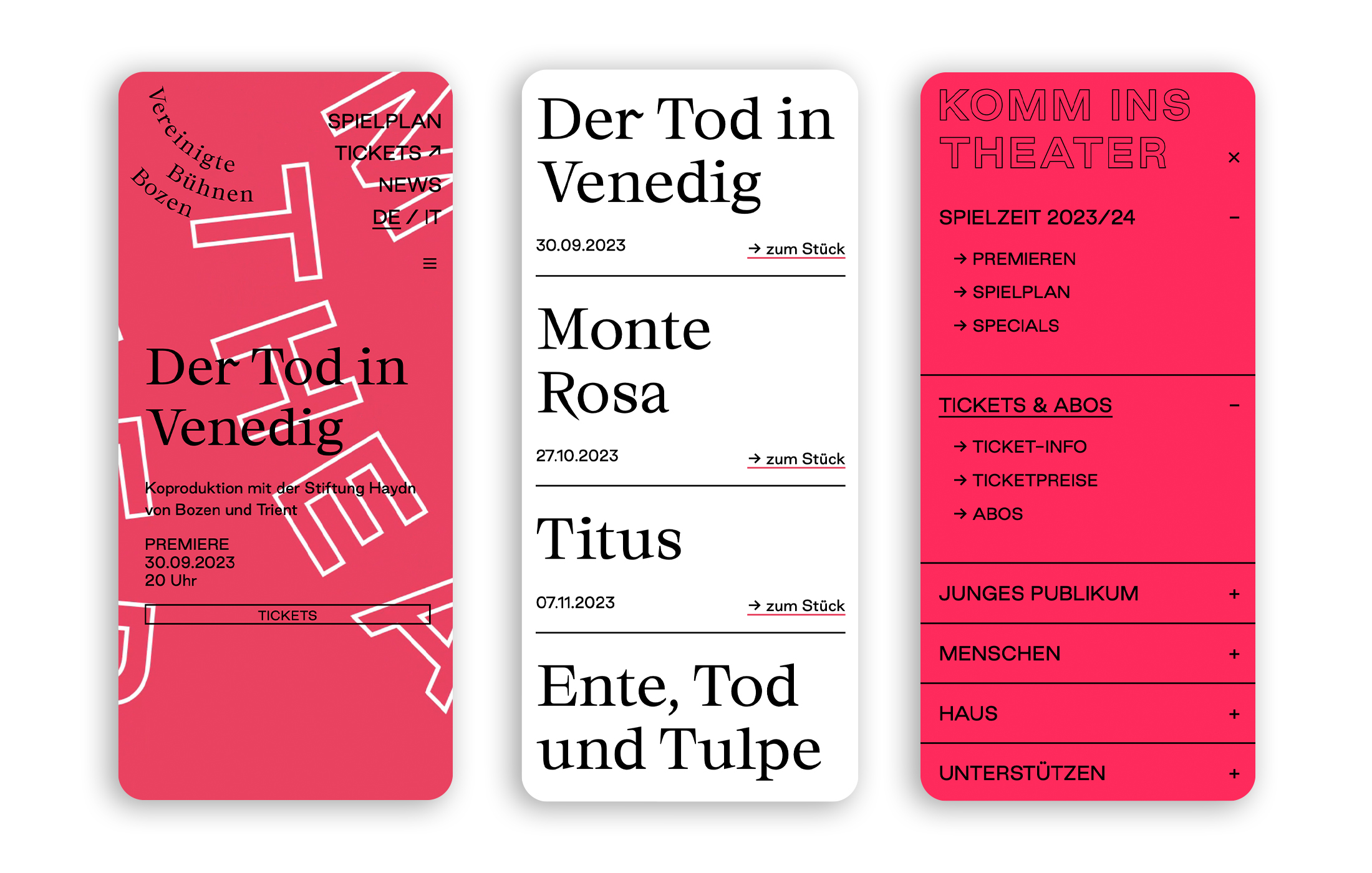
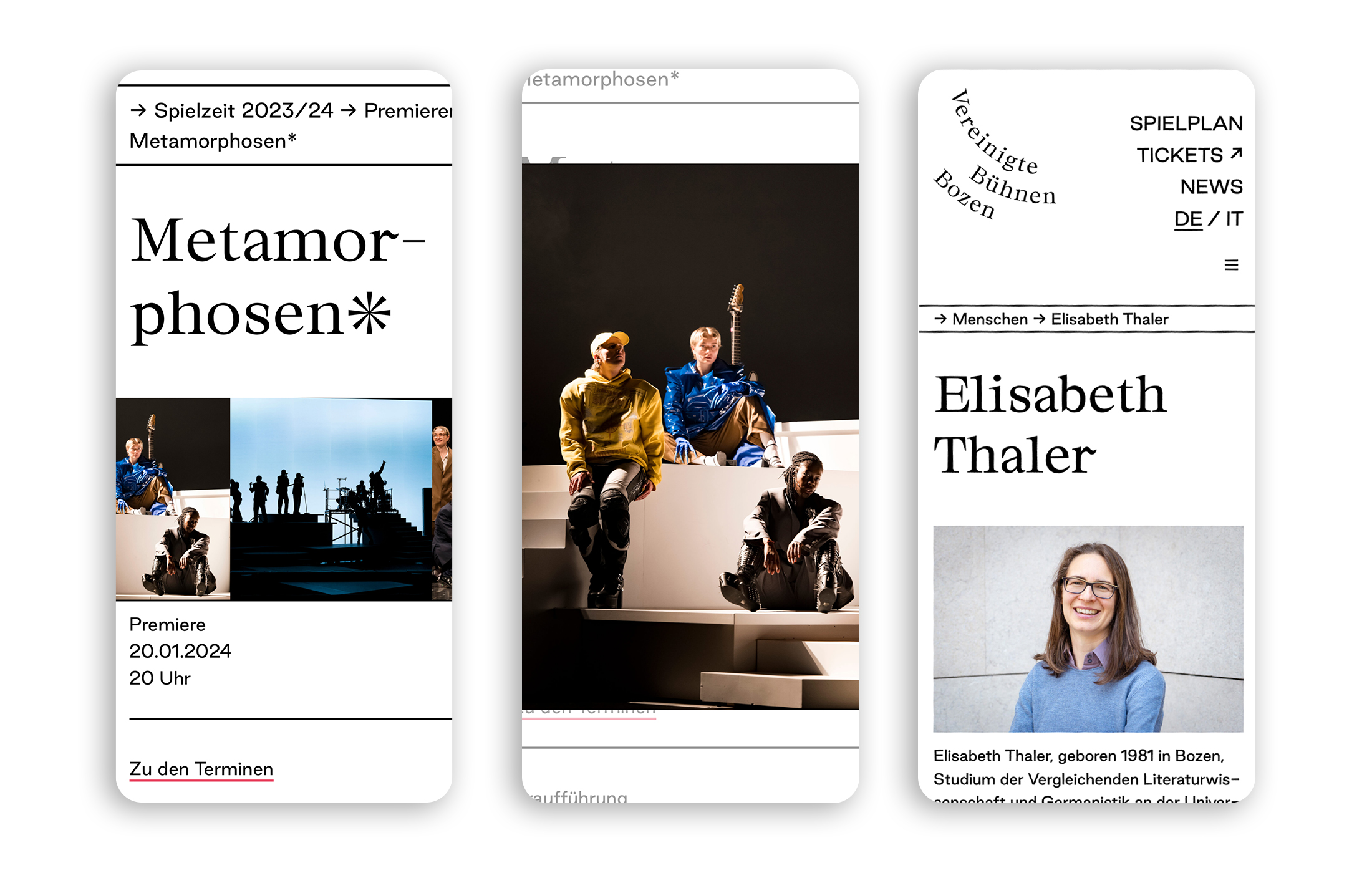
The appearance of the homepage of the theatre Vereinigte Bühnen Bozen appears every couple of weeks in new color and animation, in line with the current play. Beyond this colorful opening, the website offers all important information about the plays, their performers and staff. In addition, there are programs, news and administrative information. Like the identity of the Vereinigte Bühnen Bozen, the website is kept reduced in black and white, with generous typography.
Medium: Website > www.theater-bozen.it
Category: Arts and culture
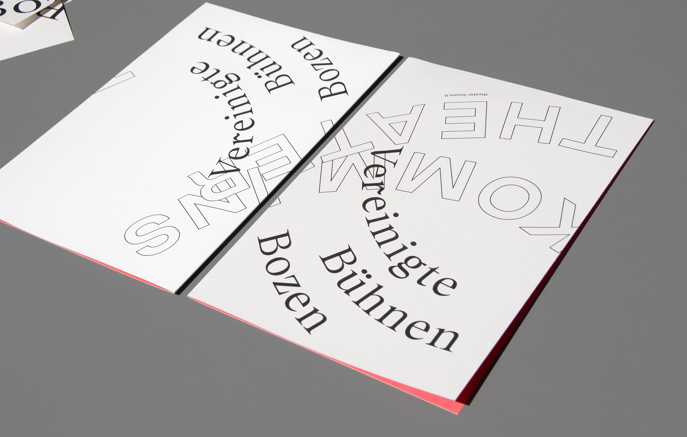
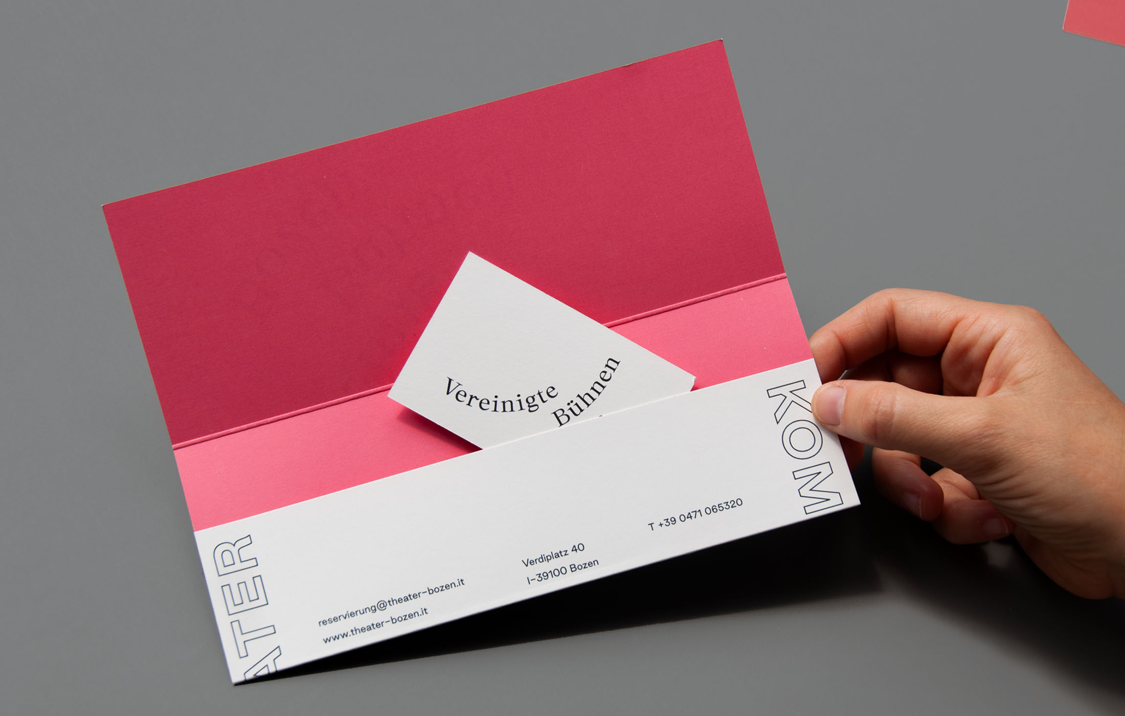
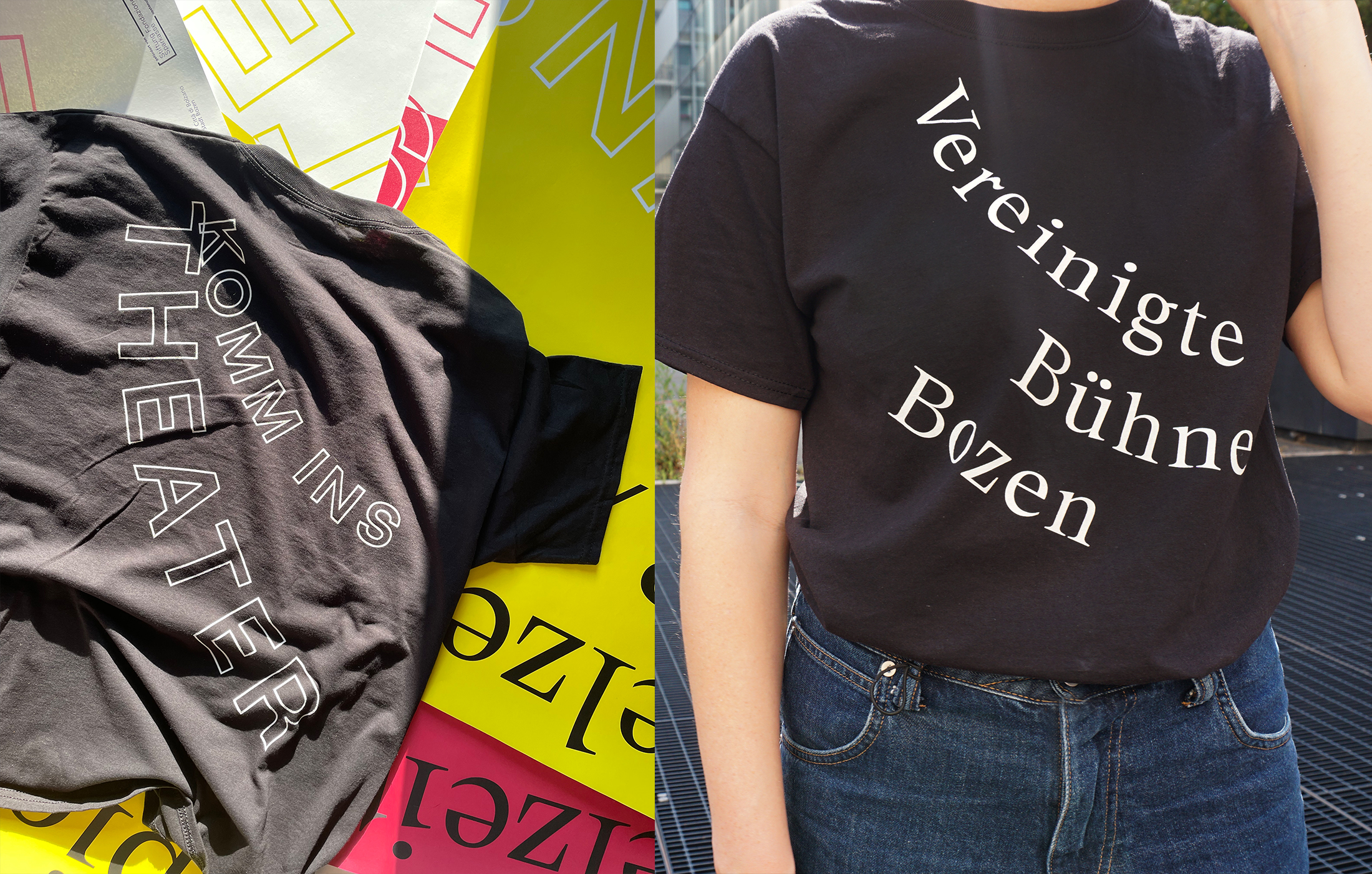
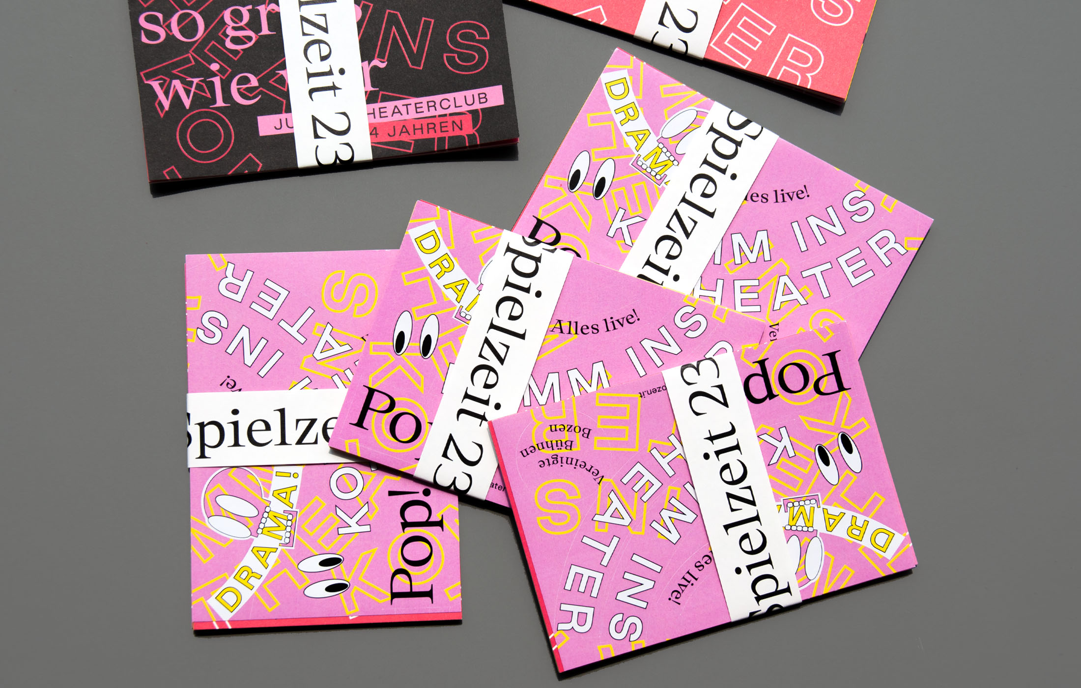
Client: Vereinigte Bühnen Bozen
Year: 2023
Content management system: WordPress
Web development: Stadtkreation
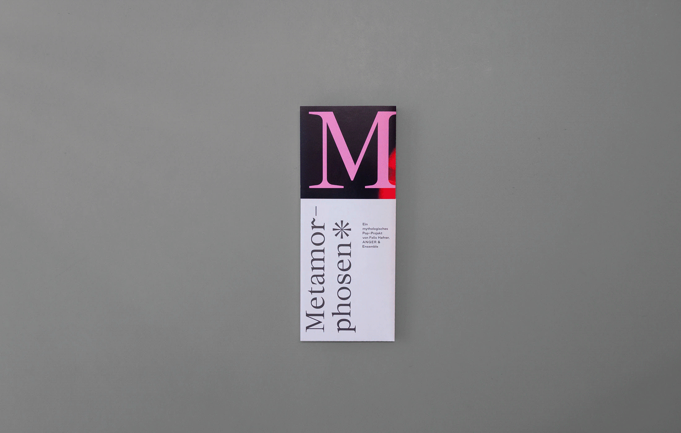
Typeface: Good Sans, Chapter
See also: Vereinigste Bühnen Bozen , Theatre Booklets