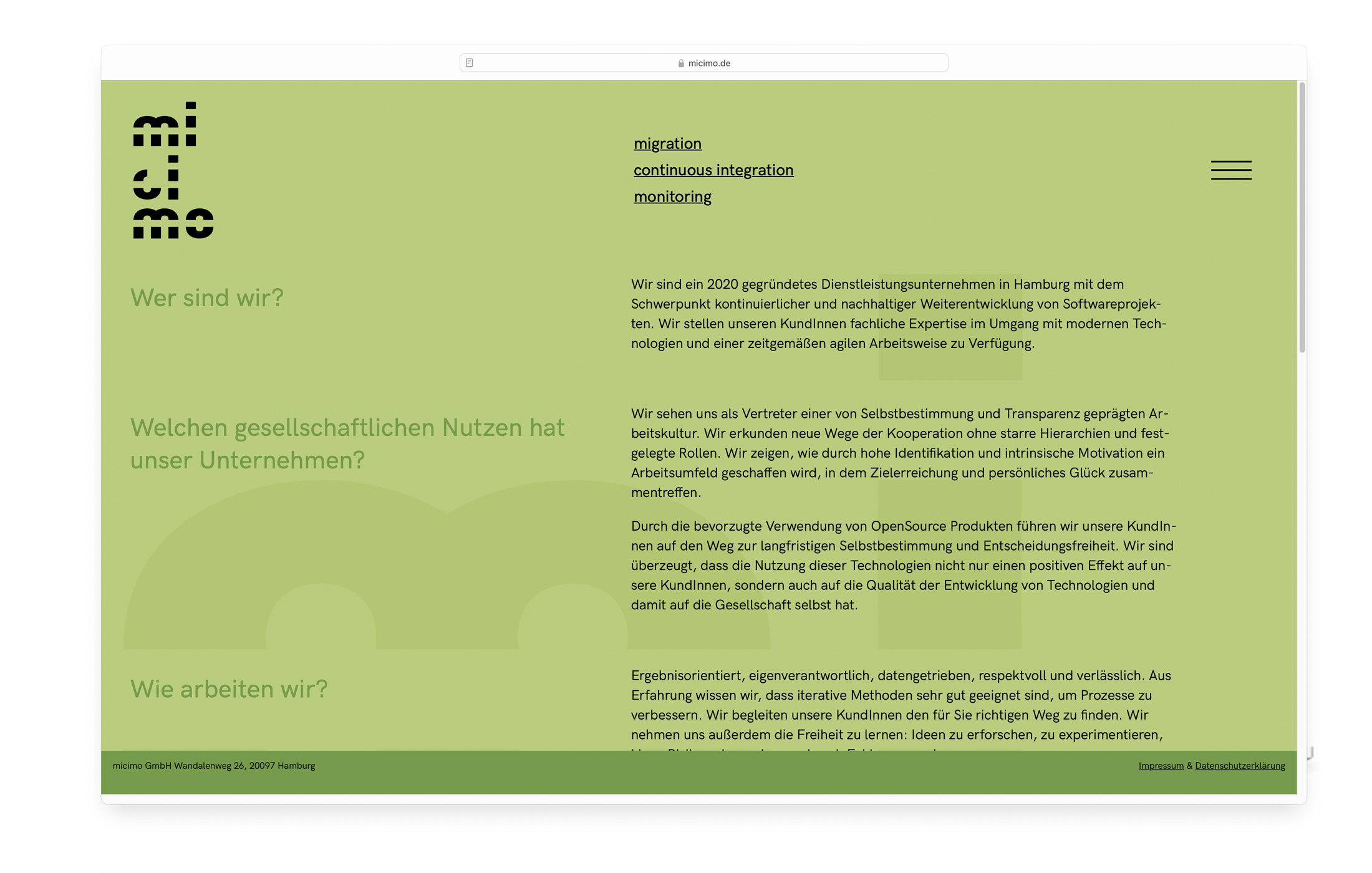
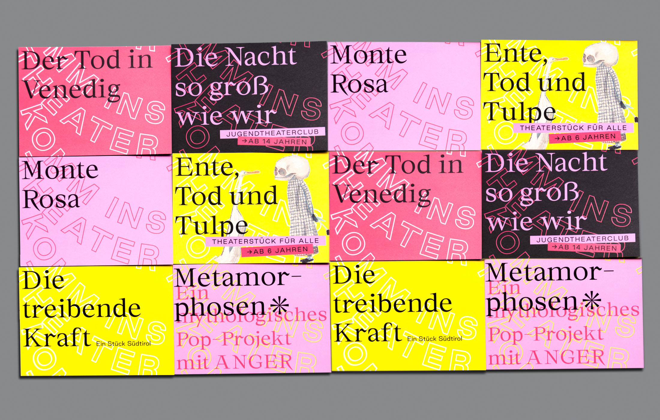
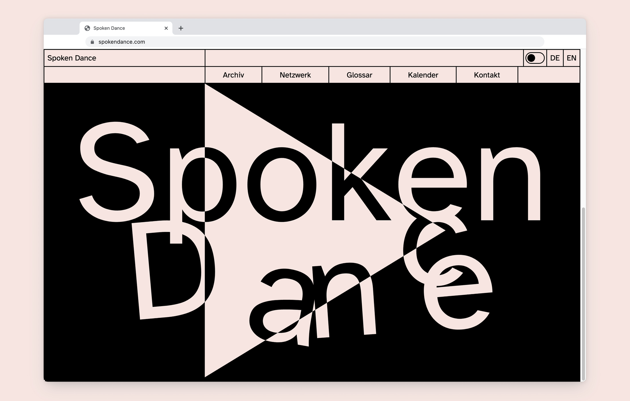
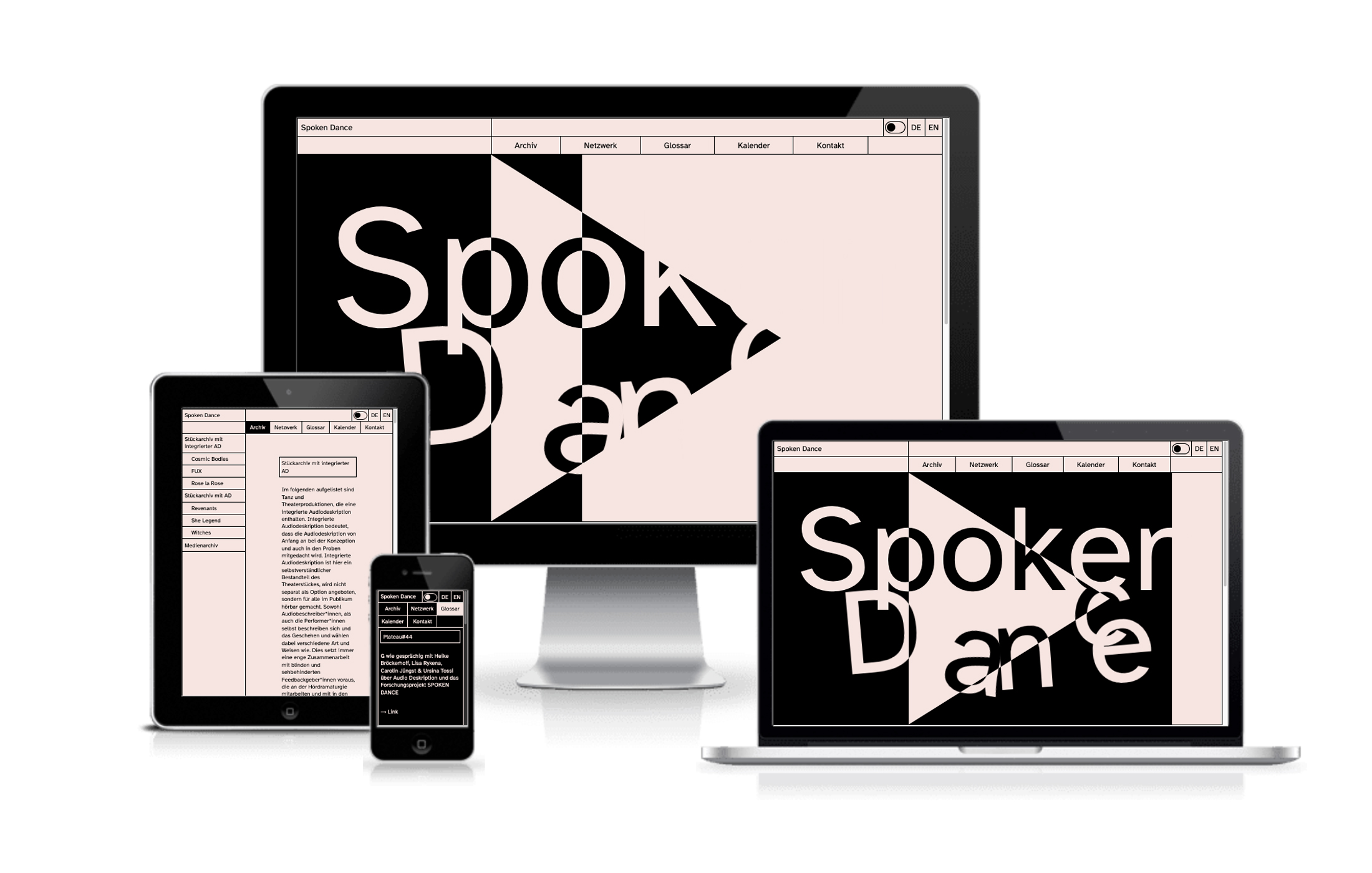
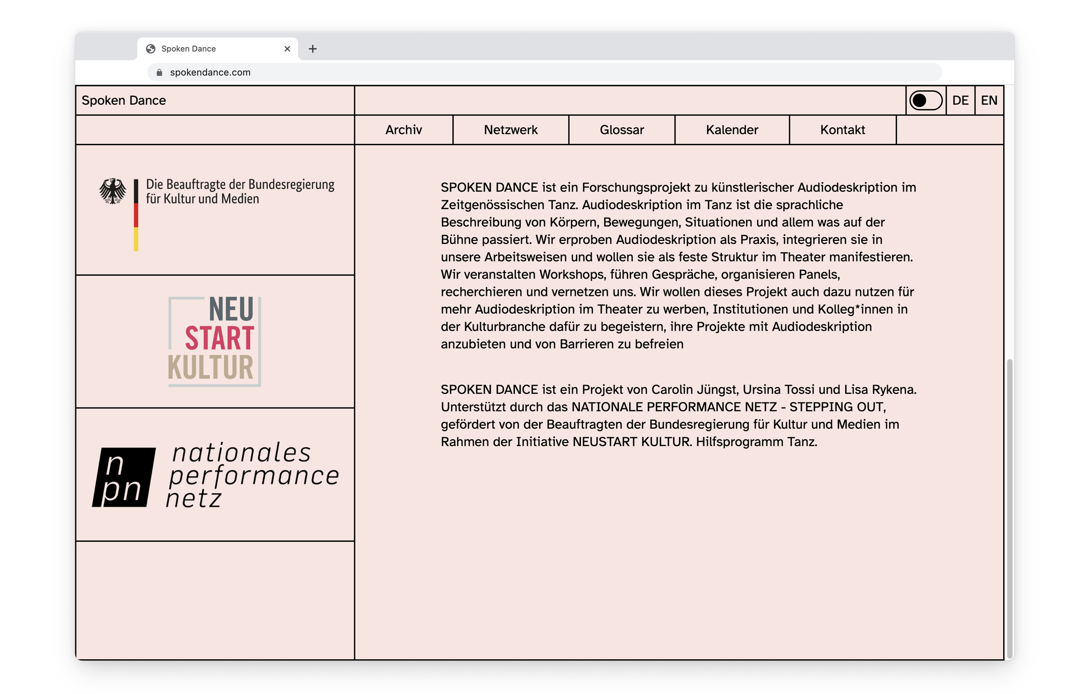
Exciting news & a restyled new website are dropping soon!
Follow us on instagram for all updates • • • Big news & a new fresh website are coming soon!
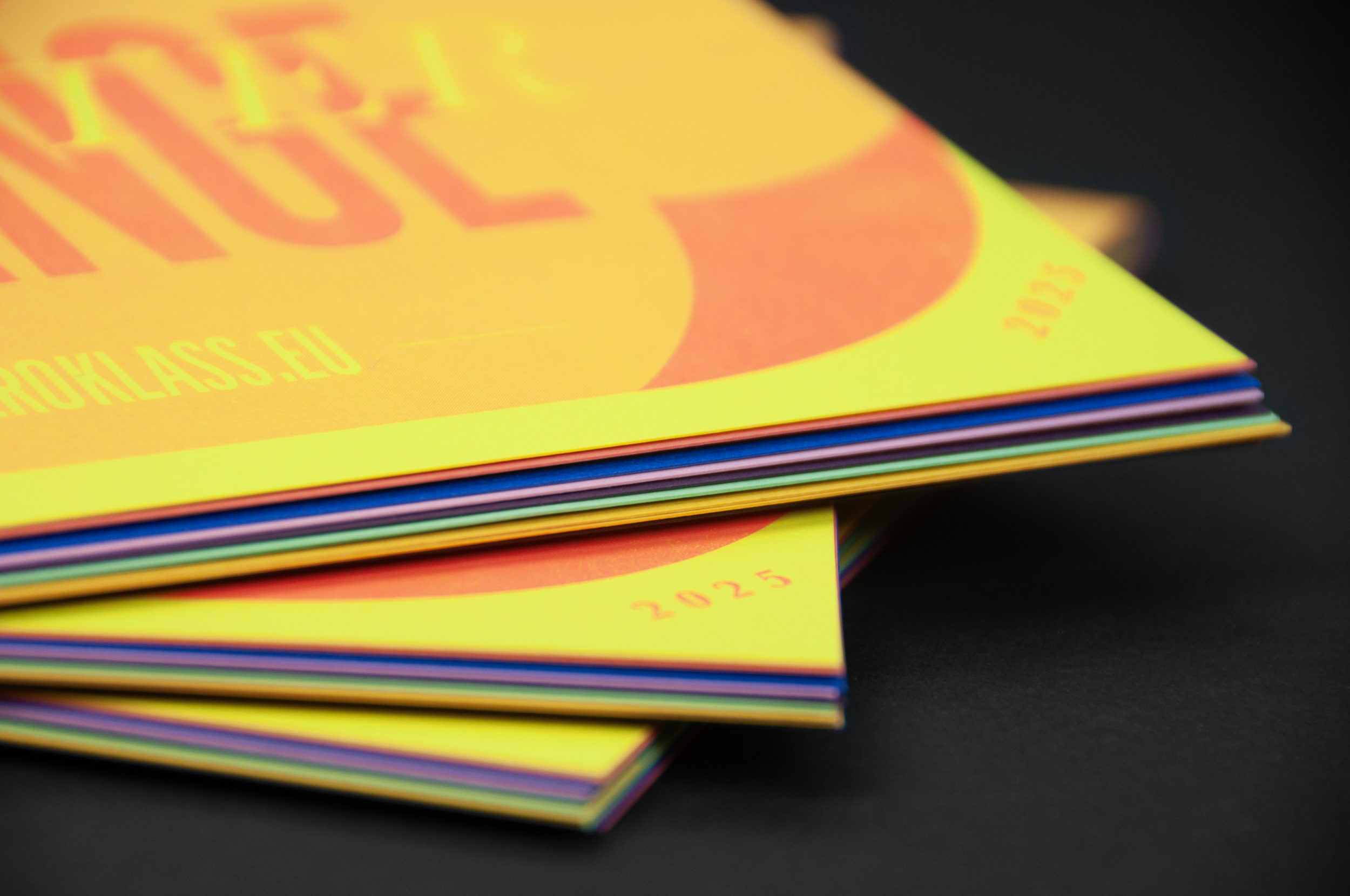
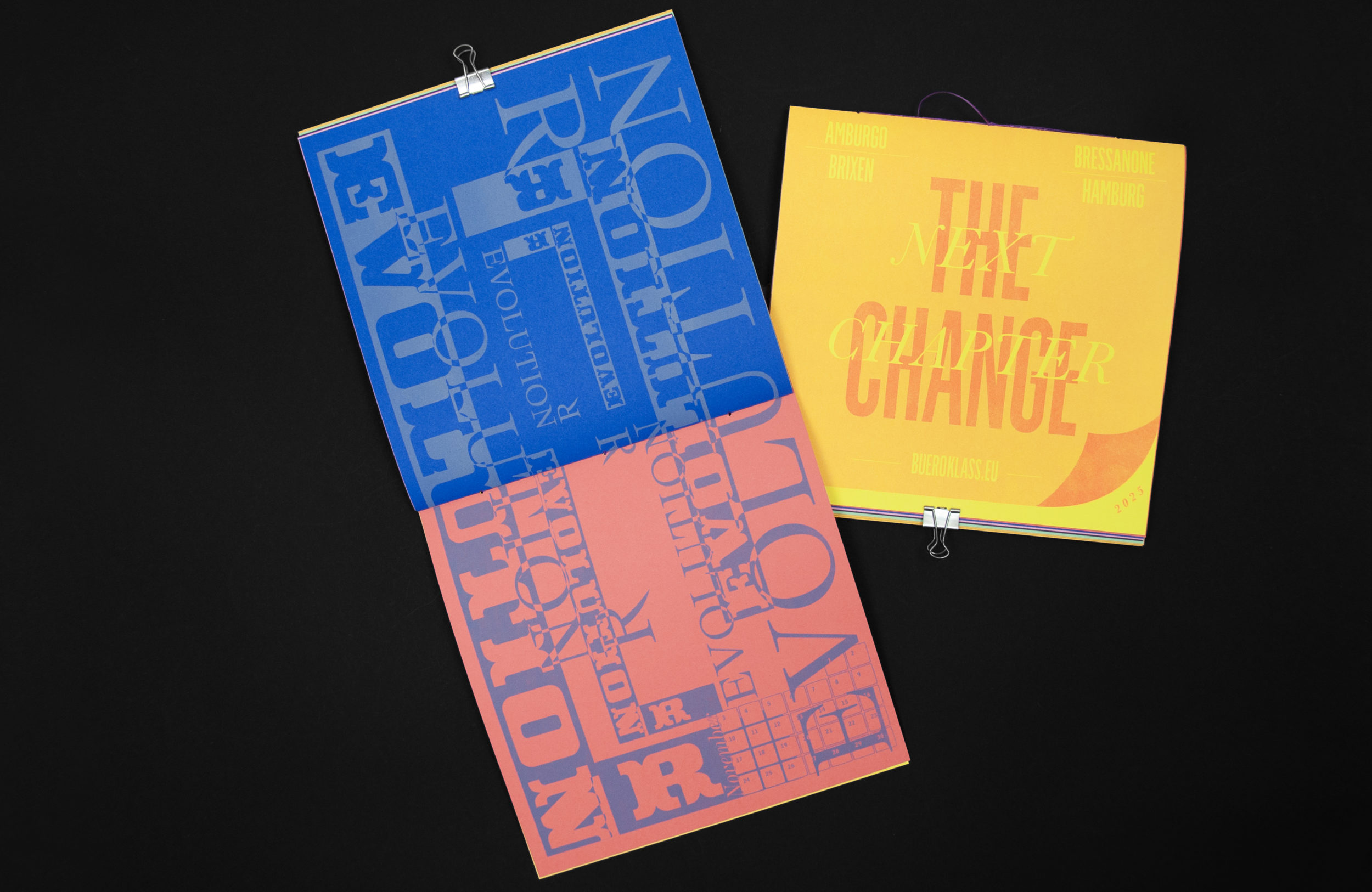
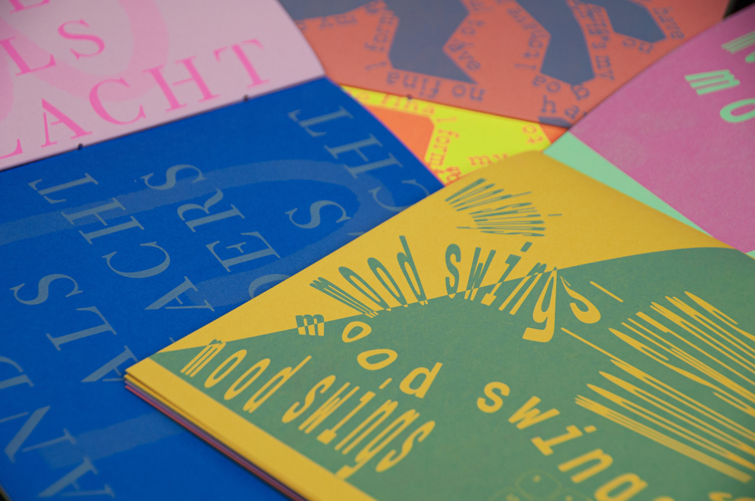
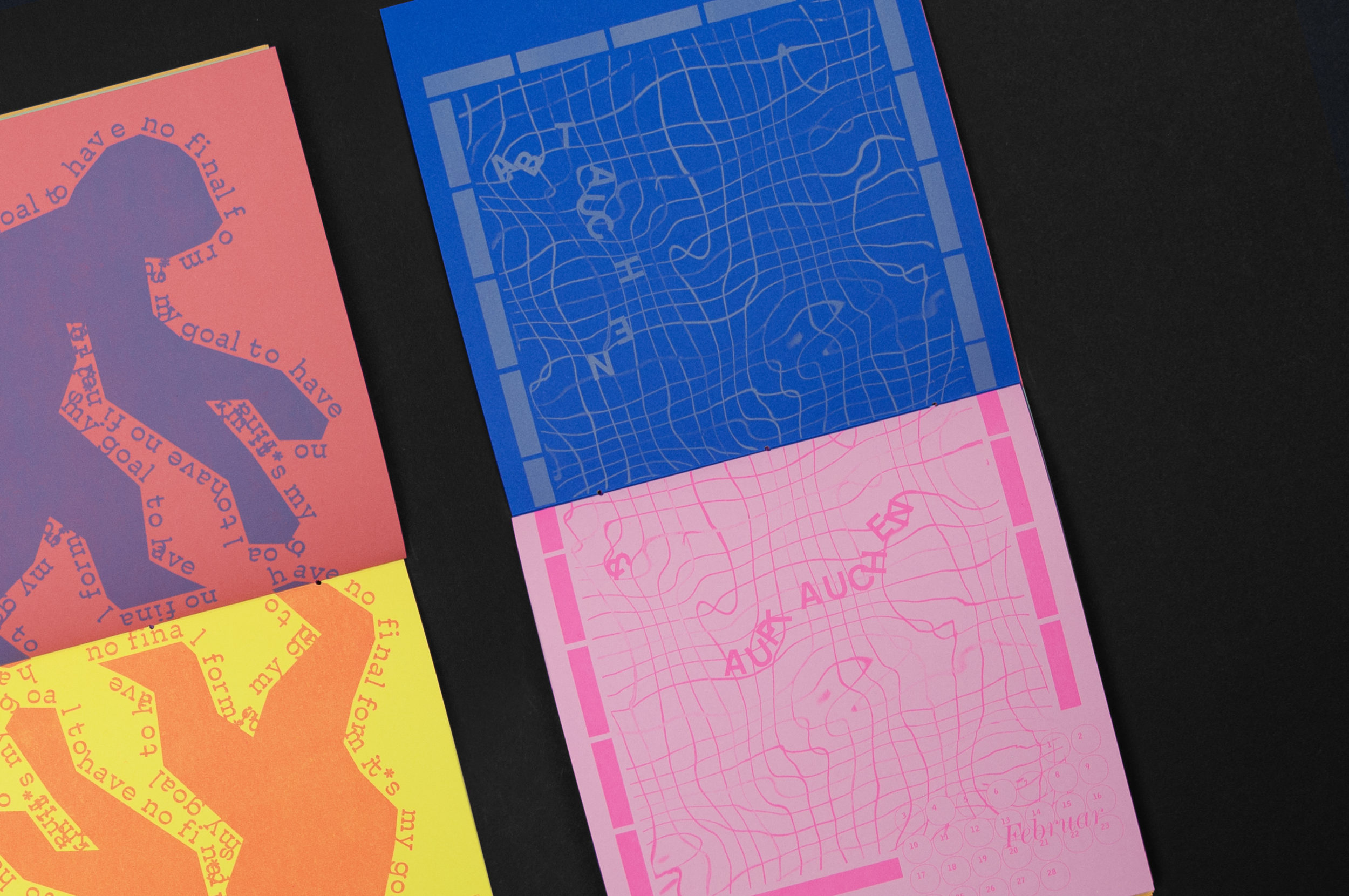
Follow us on instagram for our latest projects • • • Everything changes, yet everything stays the same • • • 2025 • • • Exciting news & a restyled new website are dropping soon!
Follow us on instagram for all updates • • • Big news & a new fresh website are coming soon!
Follow us on instagram for our latest projects • • • Everything changes, yet everything stays the same • • • 2025 • • • Exciting news & a restyled new website are dropping soon!
Follow us on instagram for all updates • • • Big news & a new fresh website are coming soon!
Follow us on instagram for our latest projects • • • Everything changes, yet everything stays the same • • • 2025 • • • Exciting news & a restyled new website are dropping soon!
Follow us on instagram for all updates • • • Big news & a new fresh website are coming soon!
Follow us on instagram for our latest projects • • • Everything changes, yet everything stays the same • • • 2025 • • • Exciting news & a restyled new website are dropping soon!
Follow us on instagram for all updates • • • Big news & a new fresh website are coming soon!
Follow us on instagram for our latest projects • • • Everything changes, yet everything stays the same • • • 2025 • • • Exciting news & a restyled new website are dropping soon!
Follow us on instagram for all updates • • • Big news & a new fresh website are coming soon!
Follow us on instagram for our latest projects • • • Everything changes, yet everything stays the same • • • 2025 • • • Exciting news & a restyled new website are dropping soon!
Follow us on instagram for all updates • • • Big news & a new fresh website are coming soon!
Follow us on instagram for our latest projects • • • Everything changes, yet everything stays the same • • • 2025 • • • Exciting news & a restyled new website are dropping soon!
Follow us on instagram for all updates • • • Big news & a new fresh website are coming soon!
Follow us on instagram for our latest projects • • • Everything changes, yet everything stays the same • • • 2025 • • •