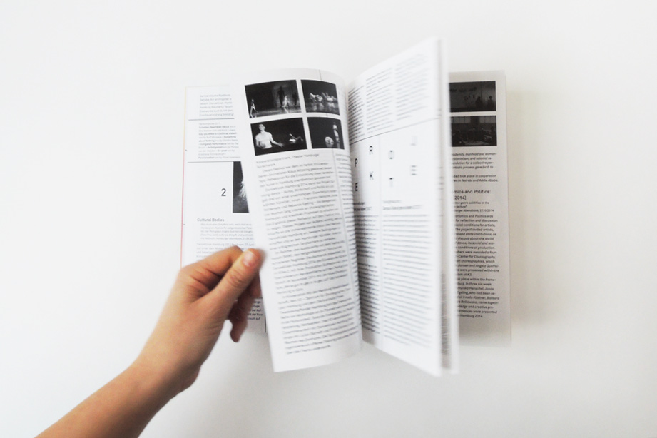
KWB

Kreativwirtschaftsbericht 2’: What about the creative industries in Hamburg? This report analyses and highlights the development of Hamburg’s creative industries in a Germany-wide comparison. The design of the brochure is clear and leaves room for tables and diagrams as well as playful details.

Medium: Book
Client: Kreativgesellschaft Hamburg
Title: 2. Kreativwirtschaftsbericht der Stadt Hamburg
Category: Public and municipal
Year: 2015
Publisher: Hamburg cultural authority
Format: 210x297mm
Pages: 128
Special features: bilingual (German and English)

Dal Ordin ala Fatura

From order to invoice – what do I have to consider? The booklet ‘Begriffe des Handwerks in der ladinischen Sprache’ helps Ladin handicraft enterprises to communicate with clients and other companies. The booklet consists of two interlinked parts: a trilingual Glossary and a part with communication examples, such as invoices or cost estimates. Both parts each have a cover. The formal contents of the booklet are communicated using lively and colourful graphic language.

Medium: Booklet
Category: Trade and craft
Client: Uniun Ladins Val Badia
Title: Dal ordin ala fatura
Author: / Editor: Ruth Videsott
Publisher: Uniun Ladins Val Badia
Year: 2017
Format: 210x297mm
Pages: 34
Typeface: News Gothic
Special features: 6-page folded cover, offset printing with two spot colours on coloured paper
See also: Issue 2, buy a copy

Lund

Cafe-Restaurant Lund is a traditional Sylt family business. For this, we conceived and designed the menu, drinks menu and ice cream menu based on an already existing CI. Lund’s product range is constantly expanding, so we designed packaging for coffee and labels for jam and wine bottles. The new packaging design for the ‘Hörnumer Fischerkugeln’ remains from the beautiful earlier design from the sixties.

Media: Various menues and labels, packaging
Category: Food and beverages
Client: Lund Sylt
Year: since 2014
Typeface: Open Sans

ganes

Since 2014 we have designed all CD artworks for the Ladin band Ganes. The design of each album refers to the musical style. Caprize comes along with colourful, imaginative collages, for an cunta che we created a mystical, infinite picture-in-picture visual (photography: Claudia Höhne). Or Brüm „blue gold“ explores water and ice and features photos of the band taken in a glacier.

Media: Cover Artwork
Category: Music
Client: Blanko Musik
Title: An cunta Che (2016) / Caprize (2014)
Artist: Ganes
Label: Capriola / Sony
Year: since 2014
See also: Music video for Bang Bang Bun

Hartikel

Hartikel.de is an online platform for artists, thinkers and authors. The magazine – of the same name, appears regularly and is designed by a different designer each time. We designed the second issue ‘Hartikel zwei’.

Medium: Magazine
Category: Arts and culture
Client: Hartikel
Title: Hartikel Zwei
Editors: Franziska Opel & Mitko Mitkov
Publisher: Franziska Opel
Year: 2016
Format: 210x297mm
Pages: 36
Typeface: Matrix, Grotesque MT
Special features: Print on demand magazine
See also: pdf version

PPGH Video

This video we conceived and realised is an intro to different events and lectures of the history faculty of the University of Goias in Brazil.

Medium: Image video
Category: Humanities
Client: Universidade Estadual de Goiás
Title: PPGH
Editor: Universidade Estadual de Goiás
Year: 2016
Typeface: CA Normal
Music: Tom Zé
See also: Poster series for Universidade Estadual de Goiás

Why not

The Hamburg event series ‘Meet &’ was initiated from the non-profit cafe ‘Why not Integration.’ The design of the print media for individual events has an expressive use of typography around the recurring visual; a colourful splash in the middle that draws the viewer in.

Medium: Poster, flyer
Category: Non profit
Client: why not Integration
Title: Meet & …
Year: 2015
Typeface: Gill Sans
See also: webdesign for why not Integration

Klangmanufaktur

Value without luxury and kitsch? The Klangmanufaktur is a workshop for the overhaul and sound improvement of Steinway grand pianos in Hamburg. We have accompanied this company since its foundation in 2014 and developed a corporate design and designed all graphic media. From workshop signage, a portfolio website, a digital instrument archive to business cards for all employees or invitations to workshop concerts.
The corporate design is based on the generous use of the CA Normal font. The use of typography and the staging of words creates a characteristic system with down-to-earth attitude.

Media: CI, websites, signage, magazine, business cards, greeting cards, flyers
Category: Trade and craft
Client: Klangmanufaktur
Year: since 2014
Typeface: CA Normal
See also: webdesign for klangemanufatkur
www.klangmanufaktur.de
www.instrumentenliste.klangmanufaktur.de

Seasons

Seasons’ is the name of the album by soul musician Ami; ‘Jungle’ the single to go with it. The design of both artworks plays with an alternation of simple black and white and bright colours. ‘Seasons’ is black and white on the outside with bright colours on the inside of the digipak and booklet – ‘Jungle’ the other way around. Painting: Petra Amare

Media: CD cover artworks
Category: Music
Client: Blanko Musik
Titles: Seasons (album) / Jungle (single)
Artist: Ami
Label: Capriola / Sony
Year: 2016
Typeface: Futura

Massoud Godemann

‘Hope’ is the third album of the Hamburg jazz trio MG3 around Massoud Godemann. We take up the meeting and metamorphosis of the three musicians, the three instruments and the balancing act that results from it with the design of the cover: with the open typography and the clear, overlapping colours and photos. We also designed tour posters and press booklets in red, green and blue.

Medium: CD cover artwork
Category: Music
Client: Massoud Godemann Trio
Title: Hope
Artist: Massoud Godemann Trio
Year: 2016
Typeface: Super Grotesk
See also: Godemann Bauder „beautiful mind“

Projeto Ere

For the history faculty of the University of Goias in Brazil, we designed a poster series for the ‘Projeto Erê’, a series of lectures on African cultural influences in South America with talks, film screenings and other formats. For the design concept we developed simple, colourful graphic patterns based on the model of African printed wax fabrics.

Media: Poster series
Category: Humanities
Client: Universidade Estadual de Goiás
Title: Projeto Erê
Publisher: Universidade Estadual de Goiás
Year: 2015
Format: 594x841mm
Typeface: Matrix

Dance Kiosk 2015

Dancekiosk is an international festival for contemporary dance in Hamburg. On the occasion of its 10th anniversary we designed a bilingual programme booklet. To save printing costs the inside pages of the booklet are printed in black and white. As a special feature we designed a coloured, transparent booklet cover which is attached with an elastic band. For the cover design and also for the festival video we used abstract algorithmic image compositions by Thomas Pfeffer.

Medium: Booklet
Category: Arts and culture
Client: Dancekiosk Festival Hamburg
Title: Hamburg’s contemporary dance platform celebrates its 10th anniversary
Editor: Angela Guerreiro
Publisher: Hamburg Ministry of Culture and Media
Year: 2015, 2016
Format: 148x210mm
Pages: 36
Typeface: Akkurat
Special features: multilingual, transparent cover with elastic band

Gesellschaft für progressives Gedenken

Progressive commemoration means creating reality. In a theatre performance at the Schauspielhaus Hamburg, the ‘Gesellschaft für progressives Gedenken’ (Society for Progressive Remembrance) is re-imagining history and turning utopias into reality. For this, we designed lettering, a programme booklet and some other print media in the style of avant-garde and modernist typography.

Media: CI, website, invitation, program booklet, sticker, various flyers
Category: Arts and culture
Client: Elise Schobeß
Title: Gesellschaft für progressives Gedenken
Editor: Elise Schobeß
Year: 2015
Typeface: Futura

Buchbiografien

In the book ‘Mein Erkenntnisweg’ artist Heiko Volkmer deals with personal questions in theory. The accompanying film ‘Buchbiografien’ tells the various stages of book production. For this purpose, we designed all print media, such as DVD covers, flyers and posters.

Media: Book, poster, flyer
Category: Arts and culture
Client: Heiko Volkmer
Title: Buchbiografien
Author: Heiko Volkmer
Publisher: Materialverlag
Year: 2014
Format: 105x162mm
Pages: 96
Typeface: Baskerville
Special features: Monochrome offset printing, thread stitching, gold embossing
See also: Materialverlag

Abyme

The brand Mise en Abyme Vodka is produced by an independent collective in Berlin. For this we designed a clear lettering and bottle labels. The name Mise en Abyme inspired a design made of linear, repetitive elements.

Media: Logo design and label design
Category: Food and beverages
Client: Mise en Abyme Vodka Berlin
Year: 2016
Typeface: Ca Normal
See also: webdesign for Mise en Abyme

25 Jahre Hubert von Goisern

To mark the stage anniversary of the Austrian musician Hubert von Goisern, the magazine we designed looks back on his versatile career, his musical development, his travels and tours. The design of the magazine supports the narrative nature of the contents and has many graphic and typographic details.

Medium: Magazine
Category: Music
Client: Blanko Musik
Title: 25 Jahre Hubert von Goisern
Publisher: Blanko Musik
Year: 2015
Format: 210x297mm
Pages: 16
Typeface: CA Normal, Garamond
See also: CD Artworks: Steilklänge, Filmmusik

Tempo de Lautreamont

The book ‘Tempo de Lautrèamont’ for the Brazilian publisher Edições Ricochete publishes lectures on the work of the French poet Lautrèamont. The lectures were held at the Universidade Federal de Goiás in Goiânia, Brazil. On the typographic cover the title and the names of the authors are repeated and concentric. They revolve around the publisher’s logo in the centre.

Medium: Book
Category: Philosophy
Client: Edições Ricochete
Title: Tempo de Lautrèamont
Editor: Fábio Ferreira de Almeida
Publisher: Edições Ricochete
Year: 2013
Format: 155x230mm
Pages: 198
Typeface: Baskerville

Laura Glauser

Laura Glauser works as a consultant, coach and lecturer. Our CI for her is based on what Laura Glauser’s work is all about. To represent her different fields of activity, we developed an extended, typographic word mark that works as a menu on the website and as a short description on the print media.

Media: CI, website, business card, letterhead
Category: Consulting
Client: Laura Glauser
Year: 2015
Typeface: Vidaloka, Montserrat

Ostaria Posta

For the hotel Ostaria Posta in the Dolomites, we designed a variable logo based on line drawings. The motif and colour changes depending on the season and application. With this, many different media such as price lists, business cards or outdoor signage can be designed in a varied and personal way.

Media: CI, website, illustrations, image booklet, price list, various flyers, business cards, signage, cotton bags and more
Category: Leisure
Client: Ostaria Posta
Year: since 2013
Typeface: Optima, Gill Sans
See also: webdesign for Ostaria Posta

BÜRO KLASS